Principle 1
Truth over polish
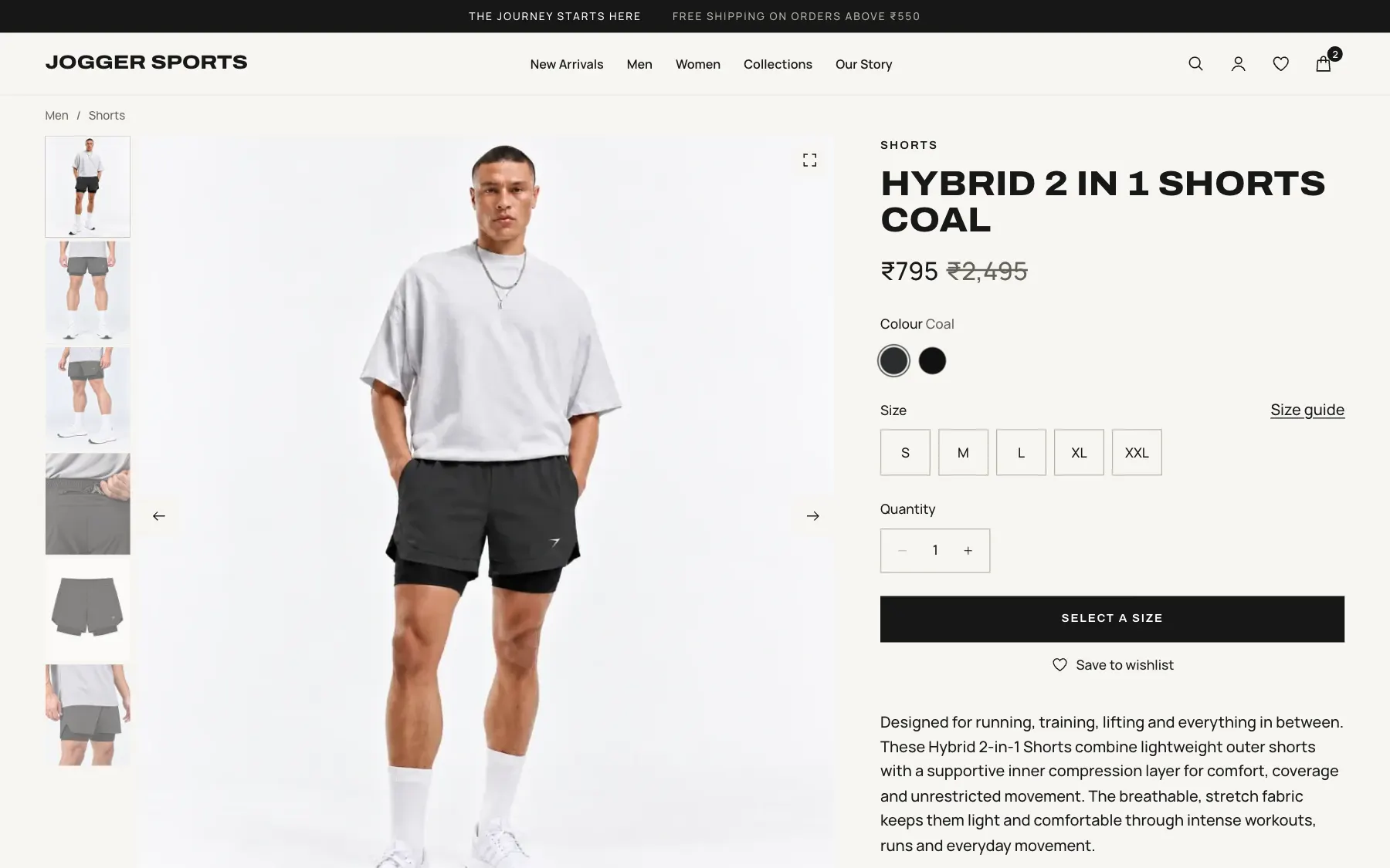
Product facts come only from brand data. With no measurements available, the size guide shows real sizes and model fit, not an invented chart.
Projects Jogger Sports
A premium activewear brand, with a home online to match.
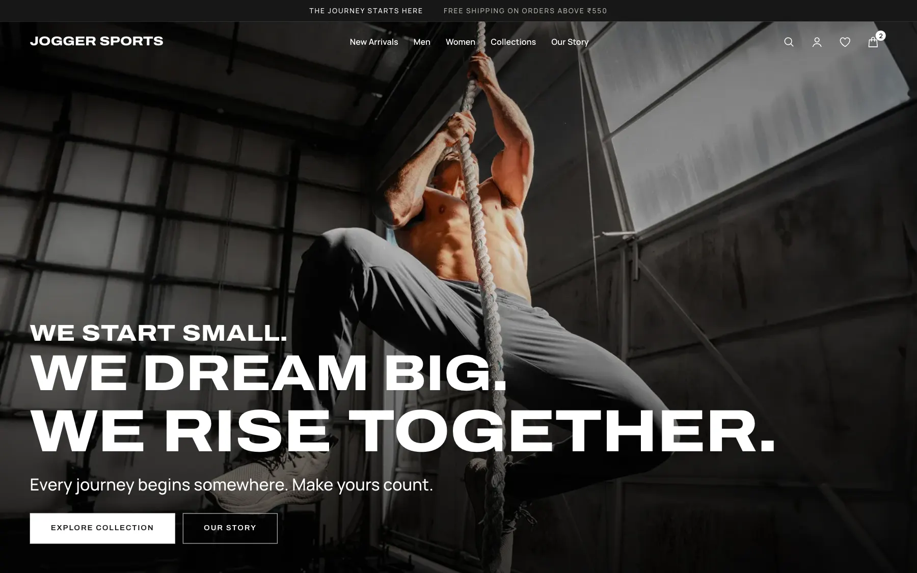
00 At a glance
01 Challenge
Jogger Sports is a premium Indian activewear label that stands for discipline and self-belief.
A premium product earns its price in the hand. On a screen, type, pace and restraint have to do that work. The range is also large, so the experience had to stay calm at scale and still get people to the right piece quickly.
One rule held throughout: nothing invented. Every price, fabric, size and policy comes from the brand’s own data.
The design brief, distilledMake a customer feel something before they buy anything, using only what is true.
Where it standsI did this work in 2022 and it went live on joggersports.com. The site’s design has changed since, but it still uses components I worked on. The screens here show the design as I made it.
02 Research
No user interviews were available, so the brand’s own data became the evidence.
I reviewed all 339 products, their size-level stock, 25 brand pages and every policy, then went through the image library by eye. I also looked at how brands like Lululemon, Alo Yoga, Vuori, Rhone and On present product, for design quality only.
296 products. Only 94 garments.
LimitNo customer research was done before the redesign, so these findings describe the catalogue, not how customers behave. Results from site analytics are in the Outcome chapter.
03 Key insights
Each colour was listed as its own product, so the range looked far bigger than it is.
87 of 296 products were sold out, so lists had to put what can be bought first.
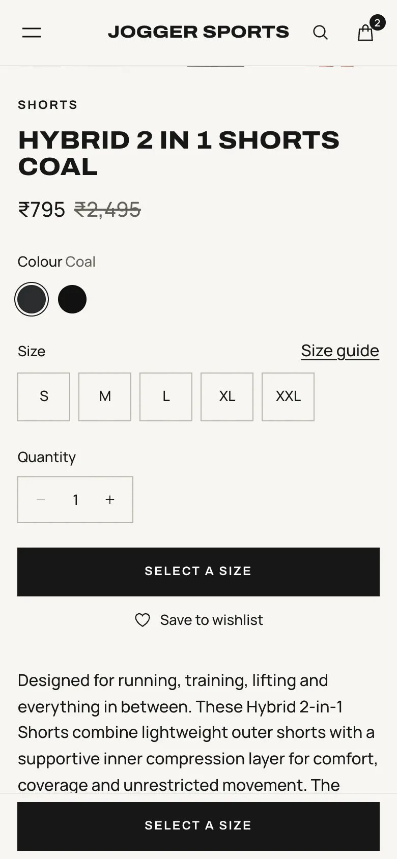
Real availability was per size, so a single “in stock” label would mislead people.
Studio shots were good. Usable lifestyle images numbered about four.
Free shipping rules, support numbers and hours differed from page to page.
Loud badges and urgency work directly against a premium position, so they had no place here.
04 Product strategy
Principle 1
Product facts come only from brand data. With no measurements available, the size guide shows real sizes and model fit, not an invented chart.
Principle 2
The philosophy and category entry points come before the product grid, because a premium label should give people a reason to care first.
Principle 3
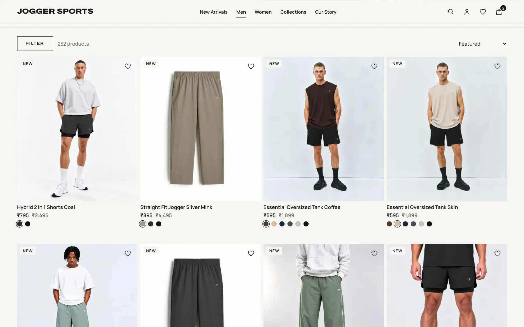
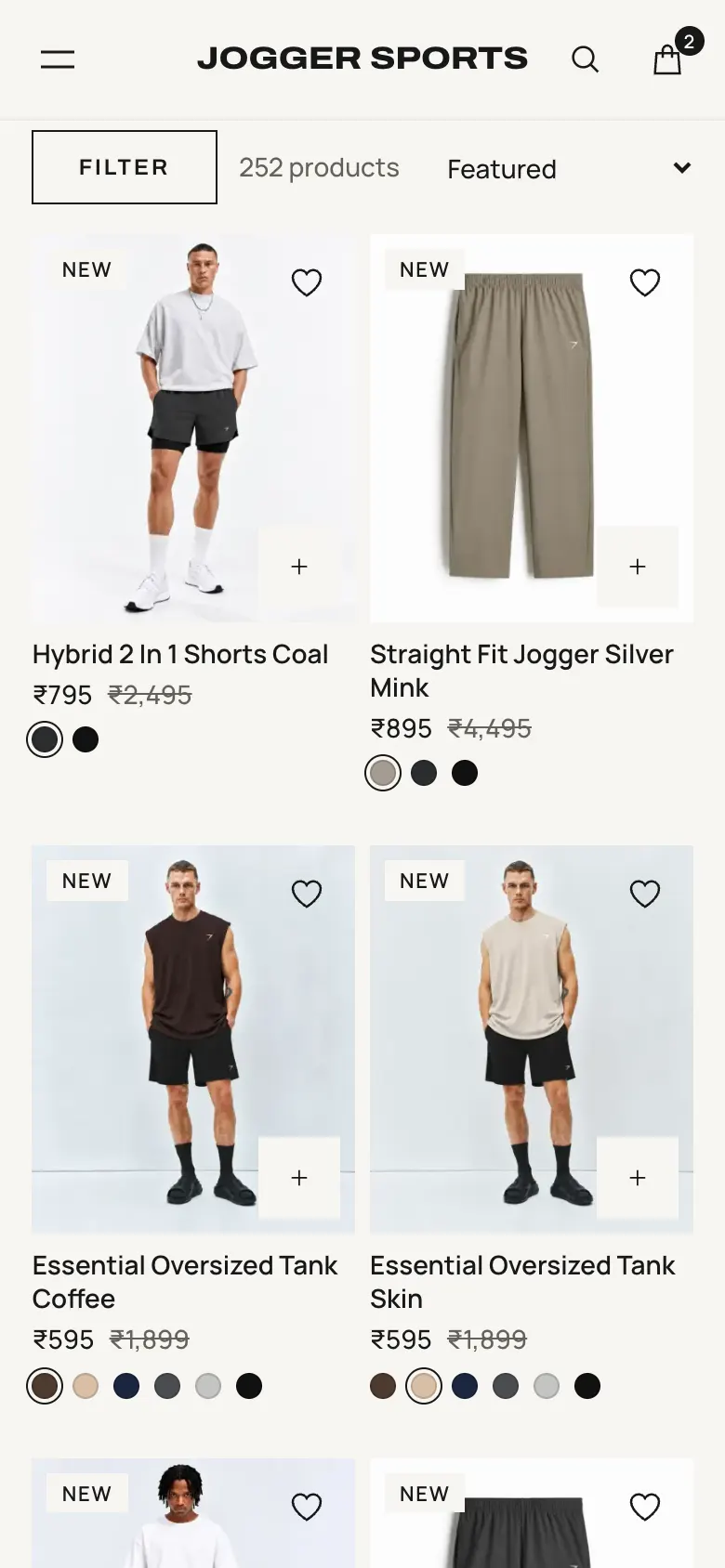
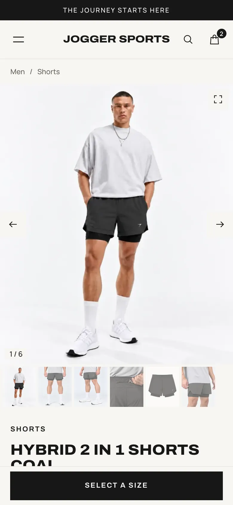
Colours are grouped into swatches, repeats are removed, and picking a colour updates the page. This answers the 296-to-94 finding directly.
Principle 4
There are no percentage badges or sale banners. Where a price is reduced, a small strikethrough says so, and the product still leads.
05 Information architecture
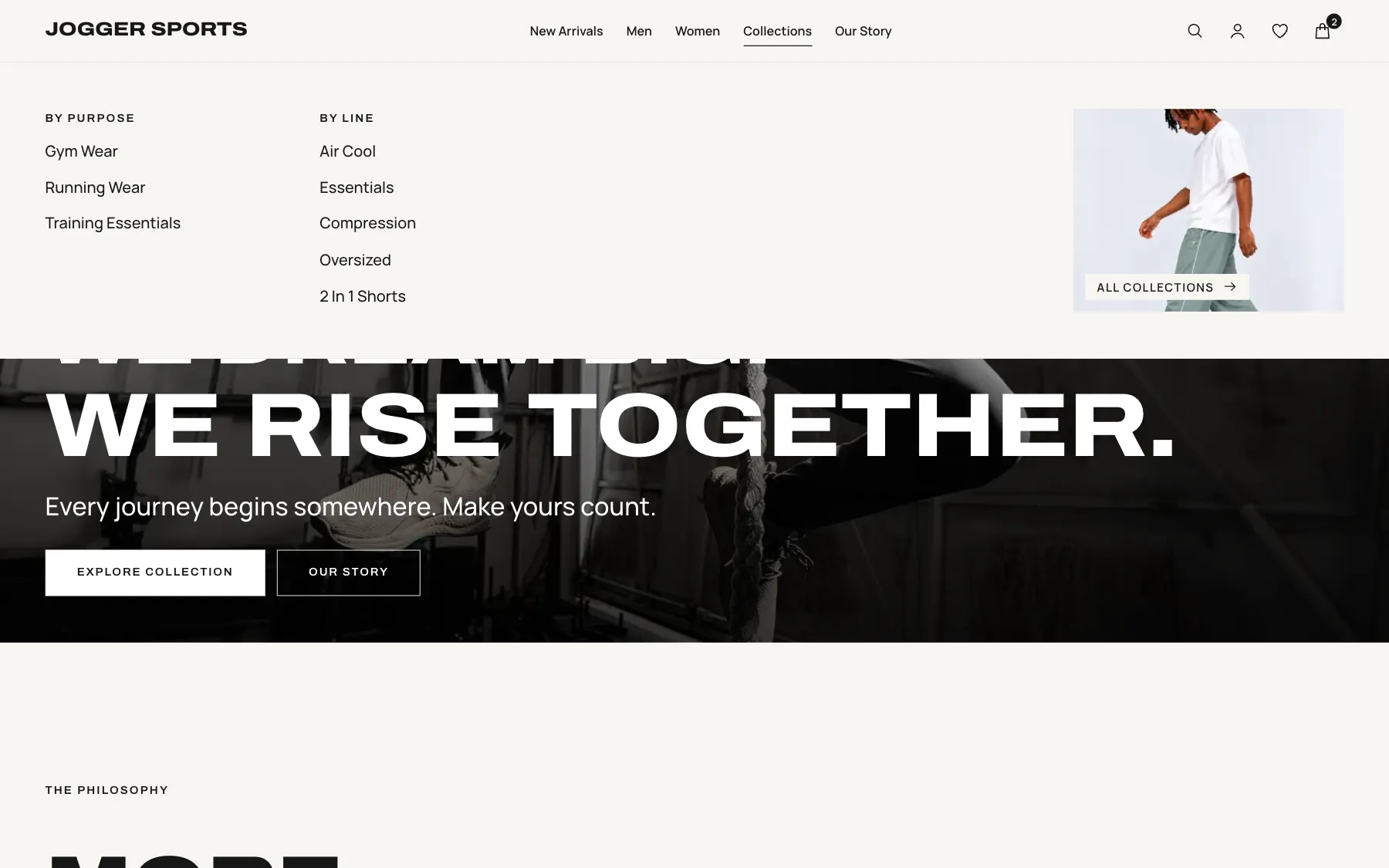
People shop by who they are, what they do, or which line they like, so the structure offers all three.
Filters only show options the current products can match, so nobody reaches a dead end. Sold-out pieces stay findable but sink below what can be bought.
Men, Women
Gym, Running, Training
Air Cool, Essentials, Compression, Oversized, 2 In 1 Shorts
06 Design exploration
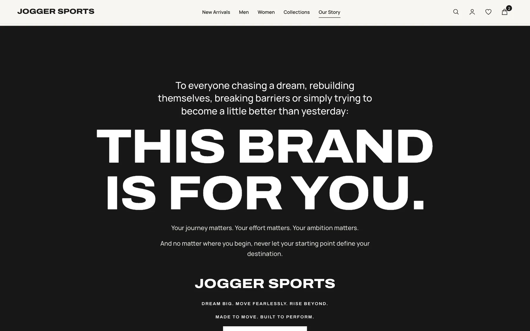
With few lifestyle photos, type had to carry the brand.
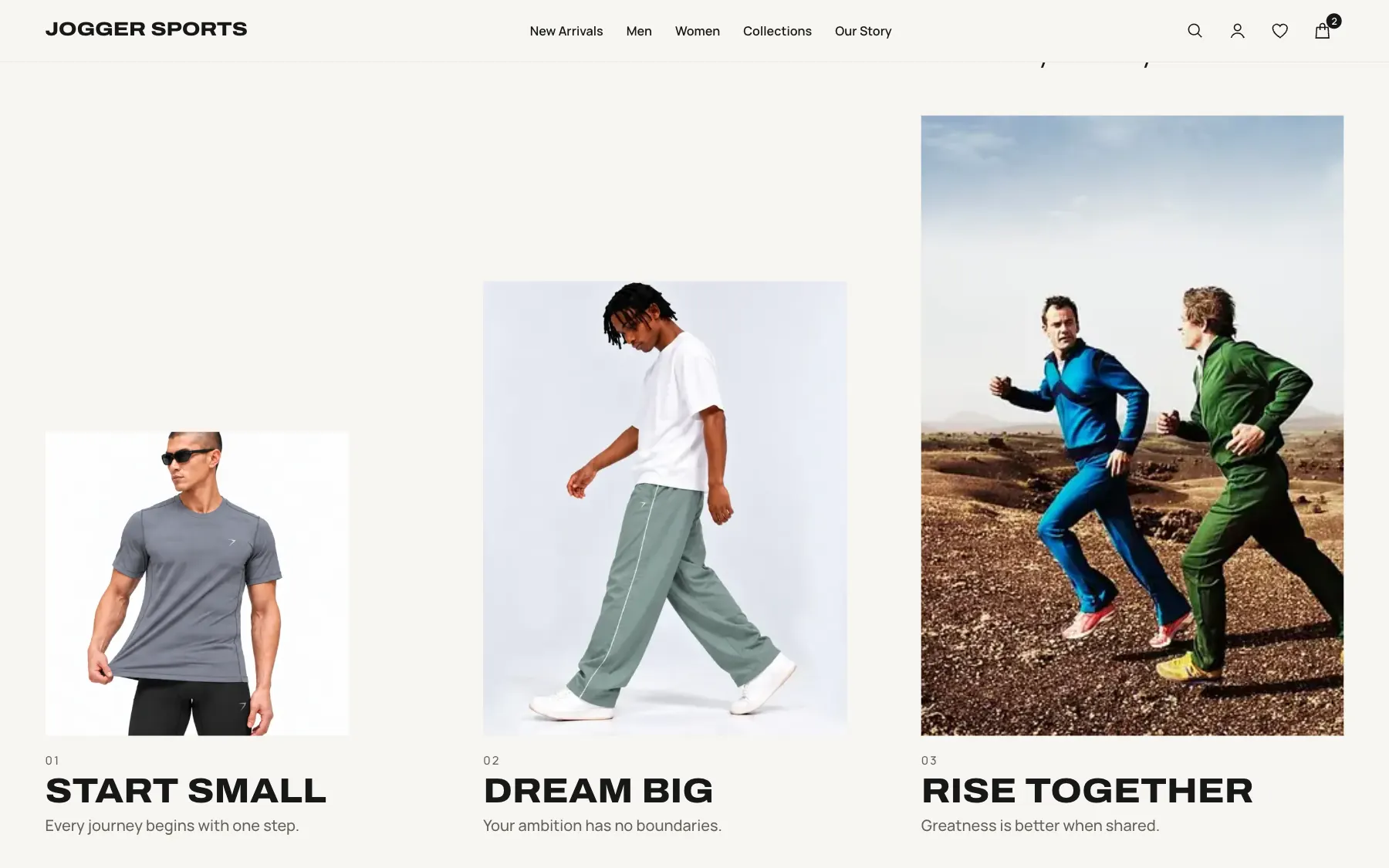
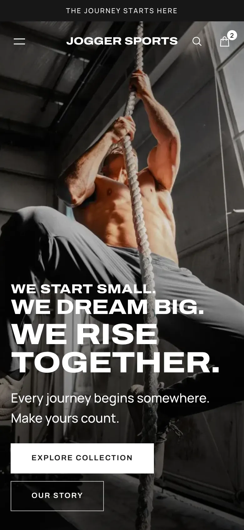
The core idea is rising type: headlines grow line by line, so “We start small. We dream big. We rise together.” is shown as well as said. The philosophy images climb in height the same way.
Type went through three rounds. An editorial serif felt too soft and was removed. Regular-width Archivo for body text felt plain. Manrope won because it stays clean beside the wide, heavy headlines. The logo also moved from an image to live type in the headline font.
I also dropped a story hero showing an office scene, because it had nothing to do with sport, and replaced it with two runners.
07 Design system
A calm stone palette lets the photos and the type do the talking.
Archivo expanded carries headlines, logo, buttons and labels. Manrope carries everything people read. Every colour pair I tested reaches at least 5:1 contrast.
#171717#F7F6F2#E9E8E3#64615A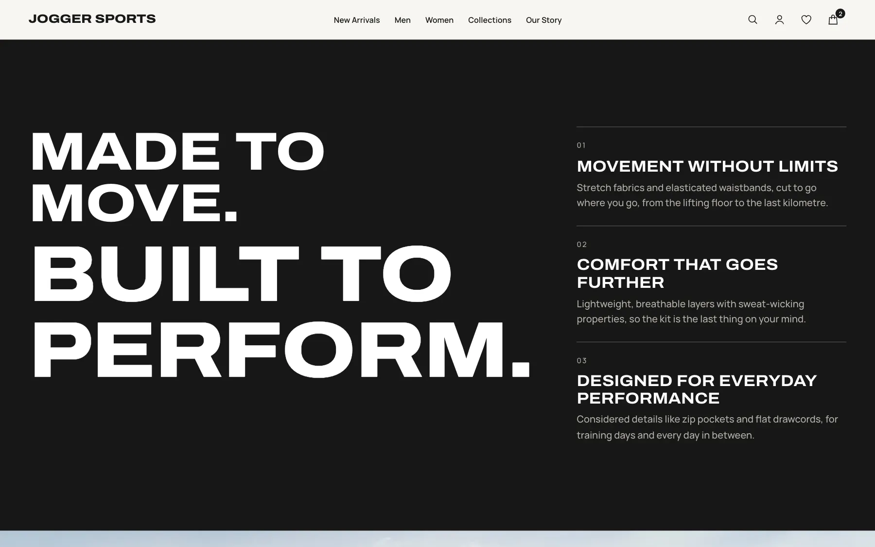
08 Final experience
Journey 1 — Discover
The site has to sell the belief and still get people to products fast.
Key moves
Journey 2 — Decide
A product page earns the purchase with honest detail.
Key moves
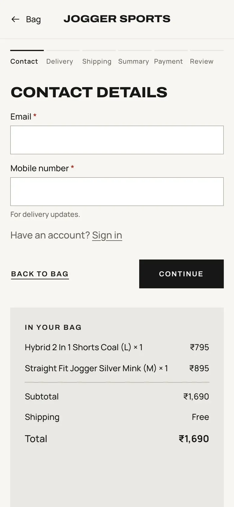
Journey 3 — Buy
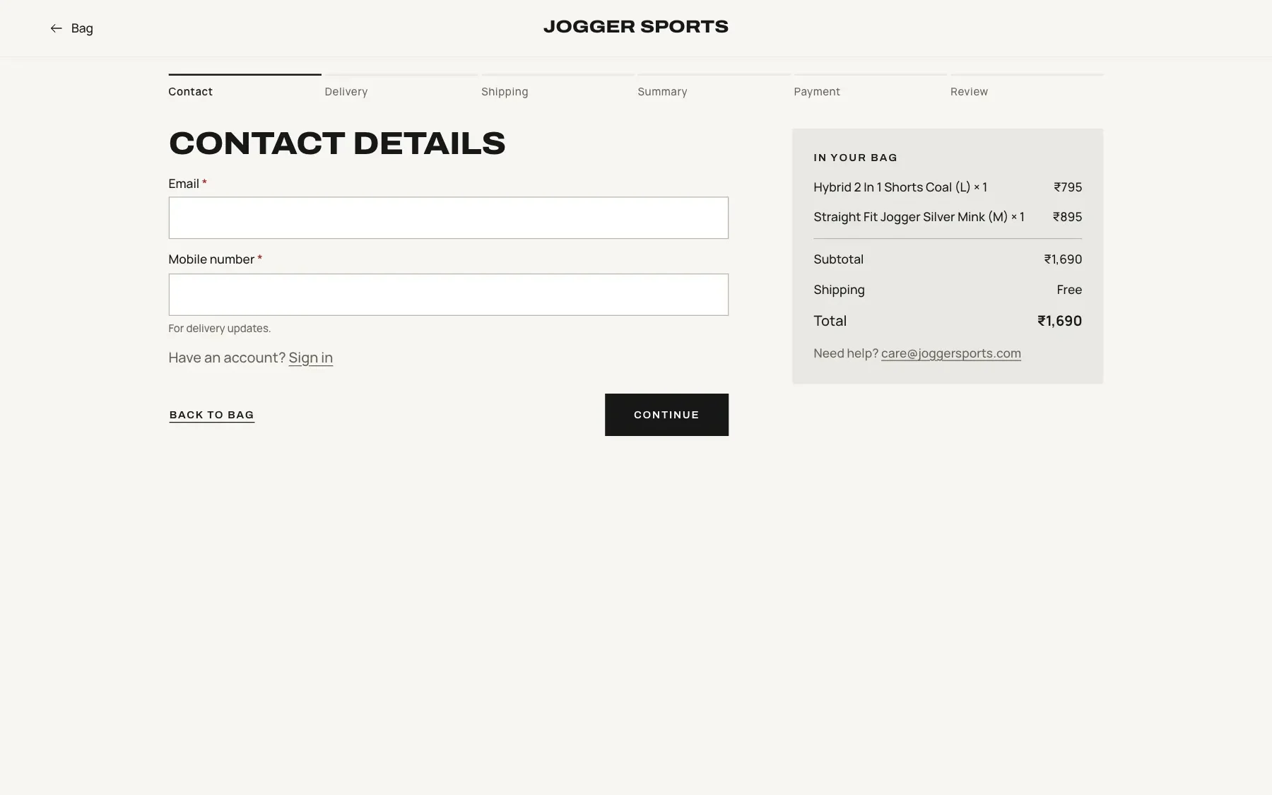
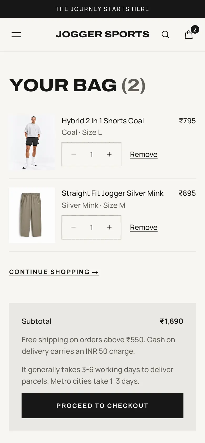
Seven clear steps, no site navigation, nothing in the way.
Key moves
09 Outcome
The work went live on joggersports.com as a full shopping experience.
It covered 22 collections and 296 product pages, with search, filters, wishlist, bag, checkout, accounts and every policy page.
The site’s look has changed since 2022, but it still uses components I worked on. A good system should survive a redesign, and this one did.
Source: site analytics, compared with before the redesign.
10 Reflection