Projects GroupBima

GroupBima

Making health insurance feel less like a burden — and more like a decision you’re proud of.

Role
Lead Product Designer
Timeline
2019
Platform
iOS & Android (Mobile-first)
Team
Product, Engineering, Brand
Responsibilities
Research, Strategy, IA, Brand, Design System, Prototyping

00 At a glance

The challenge
Make insurance accessible, transparent, and digital-first — in a market where eight competitors had scale but none had earned trust.
What I did
Audited eight competitors, surveyed users on how insurance made them feel, interviewed four users — and designed the brand before the interface.
What shipped
An end-to-end system for two user types — a consumer app and a full agent portal — and a distinct, emotionally differentiated brand.

01 Challenge

Insurance in India is a trust problem, not a product problem.

GroupBima is an IRDAI-approved insurance brokerage founded in 2018 with a clear ambition: make insurance accessible, transparent, and digital-first for Indian consumers. The product dream was real. The experience problem was too.

The user pain was threefold. Most Indians understood insurance was necessary, yet consistently deferred buying it — online or offline. The reasons weren’t financial. They were experiential. Existing platforms buried users under jargon. Agents were perceived as self-serving. Policy comparisons were overwhelming without being helpful. Trust, the most critical currency in financial services, was in short supply.

The business problem was structural. The market already had established players — PolicyBazaar, Coverfox, Turtlemint — with years of brand equity and massive user bases. GroupBima needed a differentiated experience, not a me-too product, to earn its place.

The design brief, distilled Design an insurance platform that earns trust in the first minute, guides users to the right policy without overwhelming them, and scales a brand that feels like a warm, knowledgeable friend — not a corporate sales machine.

8 competitors.
0 of them solved trust.

The eight competitors I audited, and the space GroupBima set out to earn.

02 Research

I started where the problem lived — in people’s hesitation.

Research covered three distinct tracks: understanding the competitive landscape, mapping user sentiment, and defining brand positioning through direct input from potential users.

Competitive analysis — eight players, four real patterns

I audited eight direct competitors. The findings weren’t about features — they were about failure modes: inconsistent UX, scattered information hierarchies, and over-reliance on price comparison without emotional scaffolding. The gap wasn’t functionality. It was clarity, consistency, and emotional tone.

What they had

Robust platforms, scale, and ad spend. PolicyBazaar alone drove 40,000 daily users; Coverfox ~9,000.

What they lacked

Clarity, consistency, and emotional tone. None had an experience users trusted at a gut level.

Enhanced ease-of-use

Reduce cognitive load at every decision point

Engaging UX

Design for a human being, not a transaction

Consistent design

A system that doesn’t confuse across flows

Robust IA

Make it impossible to get lost

Brand survey — I asked users how insurance made them feel

Rather than jumping to feature preferences, I ran a brand-perception survey to surface emotional associations. It covered:

The emotional map was most revealingMost users associated insurance with frustration, indifference, and doubt — not security, care, or confidence.

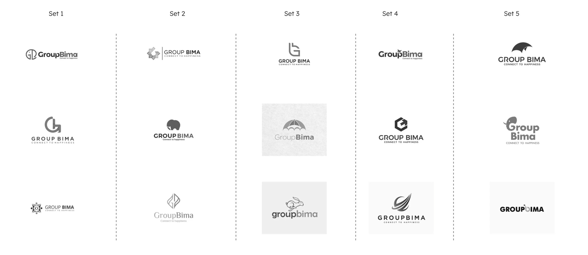
Logo & visual brand survey — five directions, tested with real users

Five distinct logo directions were presented across typography, mark style, and brand personality. User input informed the final brand decision — not the other way around.

Five sets of grayscale logo explorations for GroupBima, three marks in each set: monograms and people-shaped symbols, geometric marks and an elephant, a letterform, an umbrella and a rabbit, a hexagon and a swoosh, and an elephant with bold wordmarks

User interviews — four users, four distinct mental models

The key tension: younger users were comfortable online but didn’t trust the process; older users trusted the process but feared going digital.

Digital-native

Valued comparison features. Worried about data security. Wanted T&C clarity.

Recently converted

Bought offline for decades; a helpful consultant changed the equation. Wants faster claims and fairer settlements.

Price-led

Prefers online for savings but felt offline agents gave better service. The trade-off felt unresolved.

Offline loyalist

Valued transparent policy exploration. Distrusted agents. Found large-insurer premiums prohibitively high.

03 Key insights

What the research actually told me.

Trust is earned before the first tap

Users arrive skeptical. Tone — visual, verbal, interactive — must signal safety before asking for any input. First impressions are functional, not cosmetic.

Comparison without context creates paralysis

Everyone offered comparisons; none explained the so-what. The UI must act as an intelligent advisor, not a data dump.

Mobile isn’t a channel — it’s the only channel

Over 50% of target users access financial services on mobile exclusively. Mobile-first was a constraint, not a preference.

Emotional engagement is a trust mechanism

Positive experiences used emotional language — “I felt cared for.” Warmth needed to be woven into the logic, not just the visual skin.

The agent layer is broken — but people want a guide

Users didn’t distrust human guidance; they distrusted self-serving guidance. The opportunity: replicate the good agent, digitally.

Millennials will buy online — if you make it legible

Willingness existed. The blocker was execution: convoluted flows, ambiguous T&C, and weak visual hierarchy eroded intent.

04 Product strategy

Five principles. Every design decision ran through them.

I used these as actual filters — things to argue against in design reviews, not decoration on a slide.

Principle 1

Consistency over cleverness

Users were already disoriented by competitors. Any inconsistency would erode fragile trust. Novelty was a liability; reliability was a feature.

Decision impactSingle navigation pattern across all flows. Components behaved identically across screens.

Principle 2

Minimalism as a trust signal

Insurance is heavy with complexity. The worst response to complexity is more UI. Every element must earn its presence.

Decision impactStripped the quote comparison screen to the three most decision-relevant data points per policy.

Principle 3

Mobile-first, always

Most users would never open a desktop browser. Designing for 375px first forced better prioritization.

Decision impactAll flows designed and validated on 375px screens before any desktop consideration.

Principle 4

Research closes every loop

Insurance involves significant user anxiety. Assumptions are expensive.

Decision impactBrand survey, logo testing, and interviews all preceded visual design. No screen was final until tested.

Principle 5

Design for emotional engagement

The category default was clinical and cold. An emotionally engaging experience is not soft — it converts.

Decision impactFirst-person warm micro-copy. Onboarding framed as a conversation. Expressive iconography.

05 Information architecture

Two user types. Dozens of flows. Never let anyone get lost.

GroupBima served the Customer — a first-time or switching buyer, anxious and skeptical — and the POS Agent, managing customers, commissions, recruitment, and claims. The same platform had to feel simple to a nervous buyer and powerful for an agent managing a portfolio: a B2B product hidden inside a B2C shell.

Each gate was a trust checkpoint. Dropping out at medical disclosure was the highest-risk moment — users feared being penalized for honesty. The IA reduced this anxiety through progressive disclosure and transparent copy at every step.

The B2C shell

Customer

A first-time or switching buyer, anxious and skeptical.

The B2B product inside

POS Agent

Managing customers, commissions, recruitment, and claims. Fully designed end-to-end, with 15+ flows documented.

One platform, two very different users.
  1. 1

    Family details

    Who’s covered

  2. 2

    Medical history

    Drop-off risk: privacy concern

  3. 3

    Personal info

    Framed as personalisation

  4. 4

    View quotes

    Guided, not overwhelming

  5. 5

    Purchase

    Trust gate → conversion

* The agent portal was also fully designed end-to-end (15+ flows documented).

06 Design exploration

Brand before interface. Always.

Why the elephant?

Fifteen directions were explored across typography, symbol style, and brand register. The winner: an elephant mark in brand crimson, set in a rounded square, with the wordmark “GroupBima” and “Connect to Happiness.” Elephants carry deep symbolic weight in Indian culture — wisdom, loyalty, good fortune, familial bonds, and protection. All map directly onto what insurance should feel like: a protective presence you can trust. Strategic, not decorative.

The GroupBima elephant mark: an elephant face in a white rounded square

Brand personality

Nurturer. Communitarian. Maverick.

The deliberate choice of cool colors (deep teal, deep crimson) over the category-default orange was a differentiation signal, not just an aesthetic one.

07 Design system

A small system built to scale.

Typeface — Lexend, chosen to reduce visual stress & improve comprehension

Heading — 32/40, Bold

Body — 16/24, Regular

CAPTION — 12/18, MEDIUM

Policy card

The primary decision surface — insurer logo, coverage, premium, top benefit, CTA. Comparable side-by-side on 375px.

Stepper

Top-of-screen progress for multi-step onboarding. Signals “you’re almost there,” reducing drop-off.

Family member selector

Checkbox multi-select with age input, built for single-thumb operation.

Disease selector

Pre-existing condition disclosure — the most carefully considered micro-copy in the product: non-judgmental and transparent.

Support chip

Persistent, one-tap human support on quote screens for users who stall before purchase.

08 Final experience

The experience, told as three journeys.

Journey 1 — Onboarding

From stranger to understood

Get a user from app open to a personalised quote in under 3 minutes by reframing onboarding as a conversation.

Key moves

  • One question per screen, no scrolling forms
  • A persistent stepper and a pinned Next CTA
  • Warm first-person micro-copy
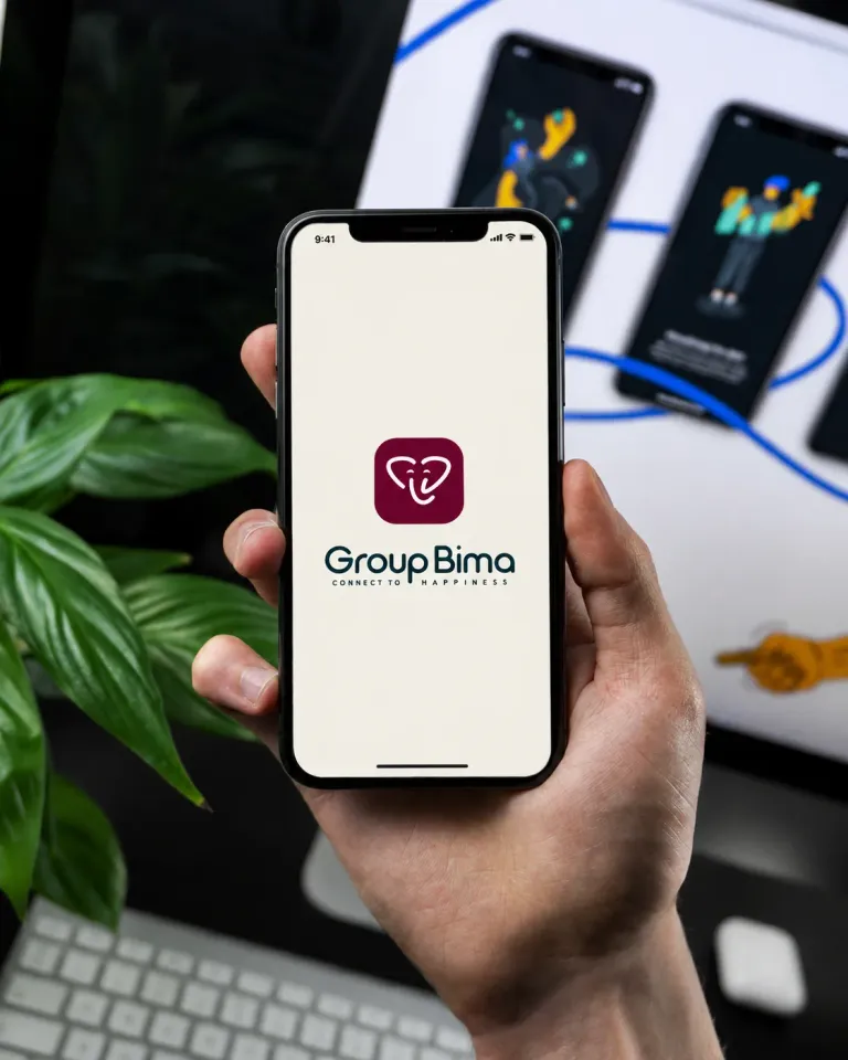
  • The splash screen makes a confident first impression
  • The family selector treats family structure as personal, not a database entry
  • The medical-history screen leads with the benefit (“This helps us find plans that actually cover you”), using tappable chips instead of form fields
  • Personal details are framed as personalisation, with a clearly surfaced skip
A hand holding a phone that shows GroupBima’s splash screen: the crimson elephant mark, the GroupBima wordmark and the line “Connect to happiness”

Journey 2 — Discovery

From details to decision-ready

Transform raw inputs into options the user understands and trusts.

Key moves

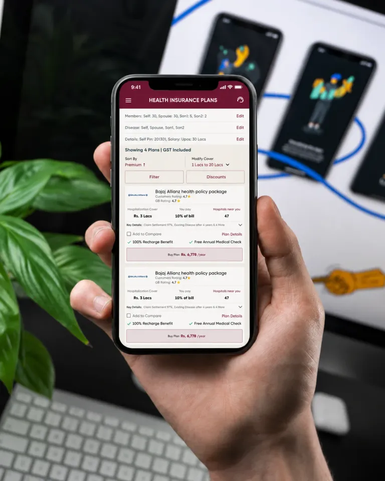
  • Each policy card leads with coverage amount, GST-inclusive premium, and one standout benefit; insurer name and a clear CTA (Go to ₹X/year)
  • Filters and discounts sit at the top for those who want to go deeper
  • Compact cards make comparison possible without scrolling between screens — editorial curation over information overload
  • A support chip is there if the user stalls
  1. 1Coverage amount
  2. 2GST-inclusive premium
  3. 3One standout benefit
  4. 4Insurer name
  5. 5A clear CTA
Three data points per policy — the three most decision-relevant.
A hand holding a phone that shows GroupBima’s Health Insurance Plans screen: sort and filter controls, and policy cards with the cover, the share of the bill you pay, hospitals nearby and a Buy Plan button

Journey 3 — Trust gate

The moment that determines conversion

Move from intent to purchase without losing the user to anxiety.

Key moves

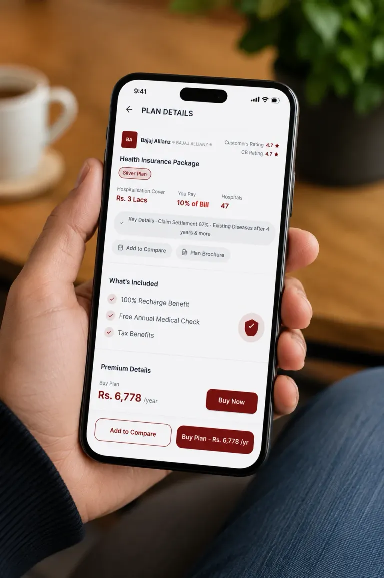
  • Privacy and data-consent screens were treated as brand moments, not legal boxes
  • Plain-language, first-person copy
  • A file-upload screen explaining why each document is needed
  • No dark patterns — users can always go back without losing progress

“We promise to respect your privacy and not bother you.”

A hand holding a phone that shows GroupBima’s Plan Details screen: ratings, hospitalisation cover, what is included, premium details and Add to Compare and Buy Plan buttons

09 Outcome

What shipped. What it meant.

No hard conversion metrics were available at project close — GroupBima was an early-stage product moving from brand to MVP. But the outcomes were real.

Product

End-to-end system for two user types — consumer onboarding and discovery, plus a full agent portal (commission, servicing, payment, recruitment, training).

Brand

A visually distinct, emotionally differentiated identity — validated through user surveys before a single screen was designed.

UX

Addressed every structural weakness identified in research: inconsistency, scattered information, cognitive overload, and trust erosion.

Qualitative signal: research surfaced a consistent finding — users who wanted to buy insurance online were blocked by bad experiences, not bad intent. The product was designed to remove those blockers, one flow, one screen, one word at a time.

10 Reflection

What I know now that I didn’t know then.

What worked

Starting with brand before interface was the right call — it prevented UI that looks good in isolation but feels disconnected from what the product stands for. Running the brand survey before locking any visual direction gave every downstream decision a foundation in real user data. The dual-user architecture forced systems thinking that made the product more durable and surfaced edge cases in the consumer flows.

What I learned

Trust is a design material — not just a principle. Every interaction pattern, every piece of micro-copy, every visual decision either builds or erodes it. In a high-stakes, low-trust category, the designer is an architect of credibility. I also learned to treat research artefacts as deliverables in their own right — that’s how you build alignment with stakeholders who need the why before the what.

What I’d improve today

The onboarding still asks for too much before delivering value — I’d add a “show me what’s possible” moment (a price estimate or sample comparison) before collecting any data. The agent portal needed its own design sprint separate from the consumer product. And the wireframe-to-high-fidelity jump was too fast; today I’d build and test a mid-fidelity prototype to keep feedback on the UX, not the aesthetics.

What I’d change

Let people see the product’s promise before asking them to invest in it.

With AI, today

Redesign discovery as a conversation — the right policy in under five exchanges, ranked by best fit, not highest commission.

AI would also reshape the agent’s role: surfacing at-risk customers, flagging claims anomalies, generating renewal nudges, and drafting support responses — shifting the problem from information architecture to interaction design for AI-mediated workflows.