Arpit Jain
DESIGNER AND DEVELOPER
About
Hello 👋
I am UX/UI product designer with Frontend skills having 12+ years of experience.
Driven by user empathy, resourcefulness, and minimalist aesthetic, I'm obsessed with simplifying complex UX problems. Another part of my life is traveling, healthy living, and music.
Over the years, I’ve designed UX/UI and developed front-end for native apps, responsive web apps, marketing websites and landing pages for different industries including SaaS, e-Commerce, Industrial, Education, and more.
I love helping companies and start-ups design new products, solve existing customer & user problems, define delightful, interactive user journeys, and increase customers loyalty through effective UX and UI design.
If you value clean and modern UX/UI design and pixel perfect frontend you would love to work with me!

I'am UX/UI Designer Frontend Developer Freelancer
LOCATED IN BOMBAY, INDIA
My Works
SOME OF MY BEST PROJECTS
Case Study
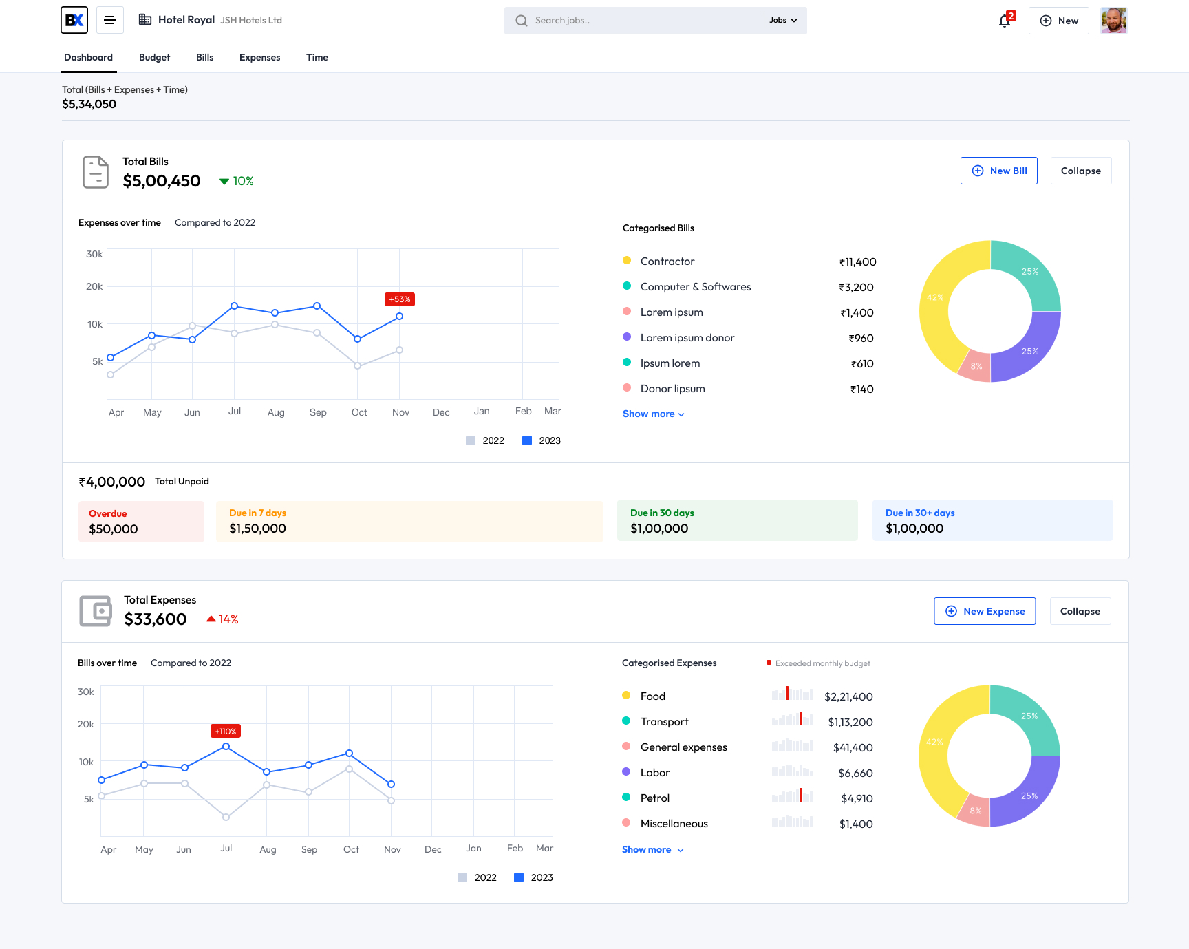
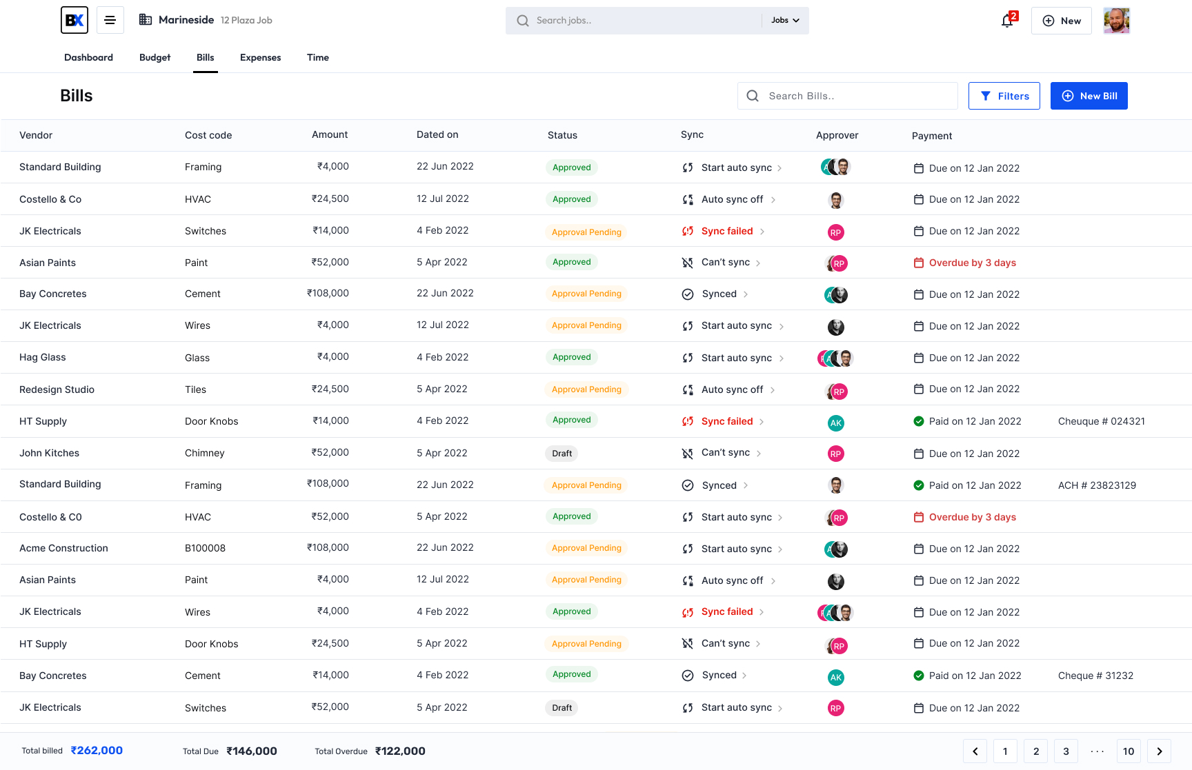
Introduction (The Problem)
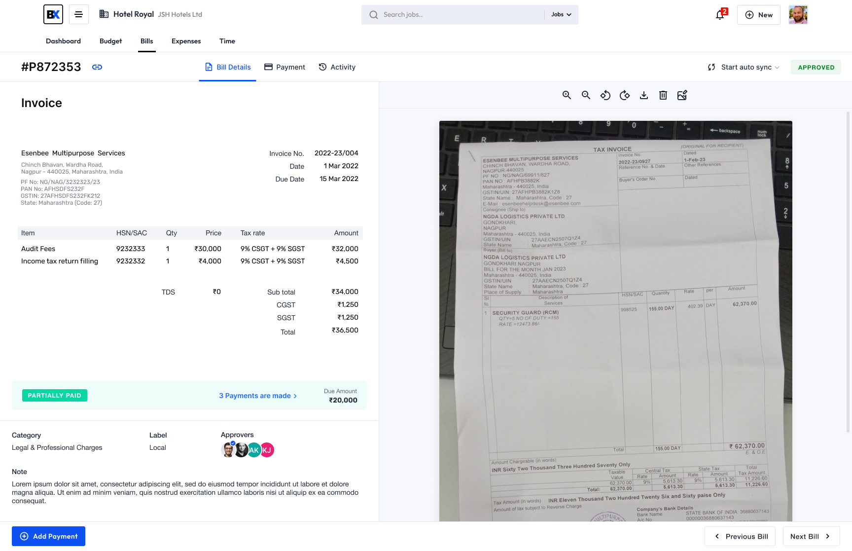
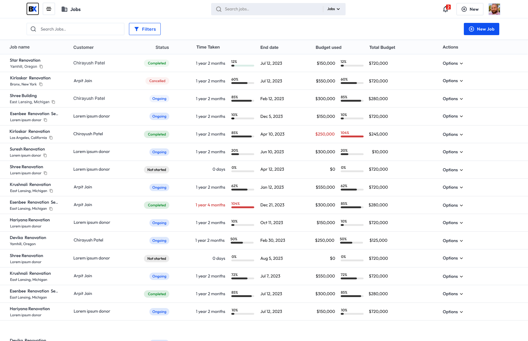
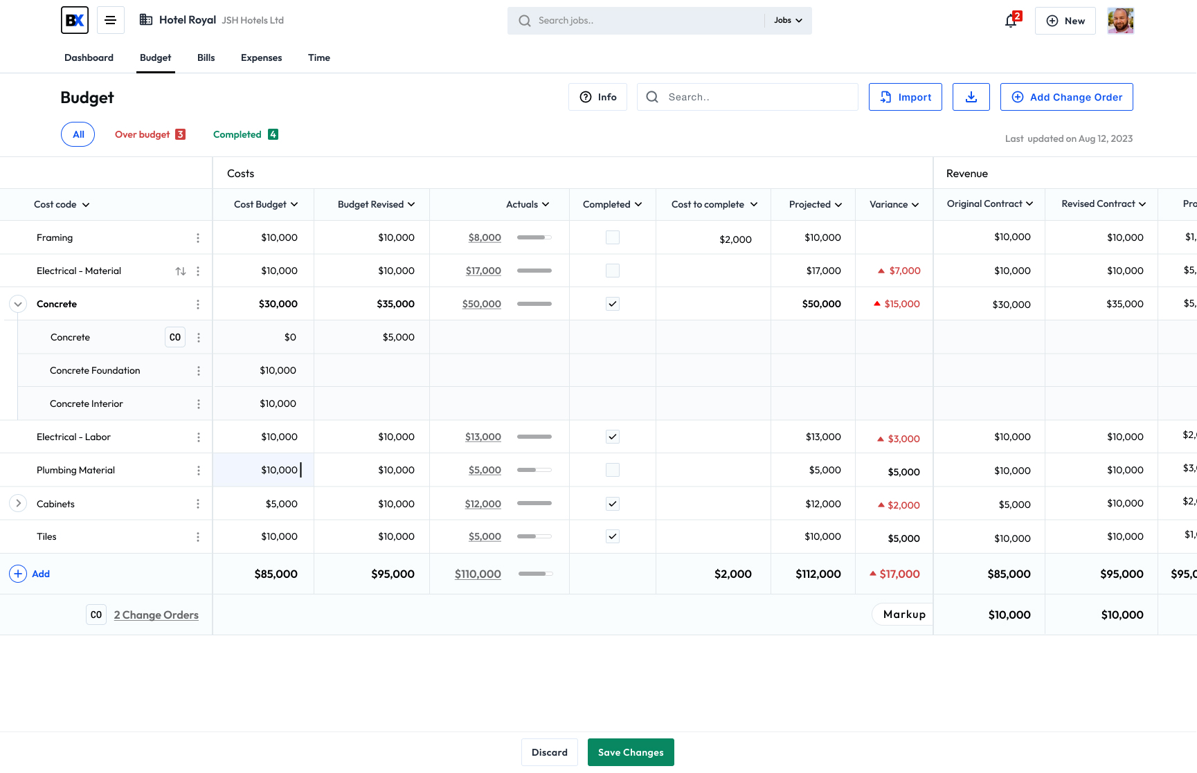
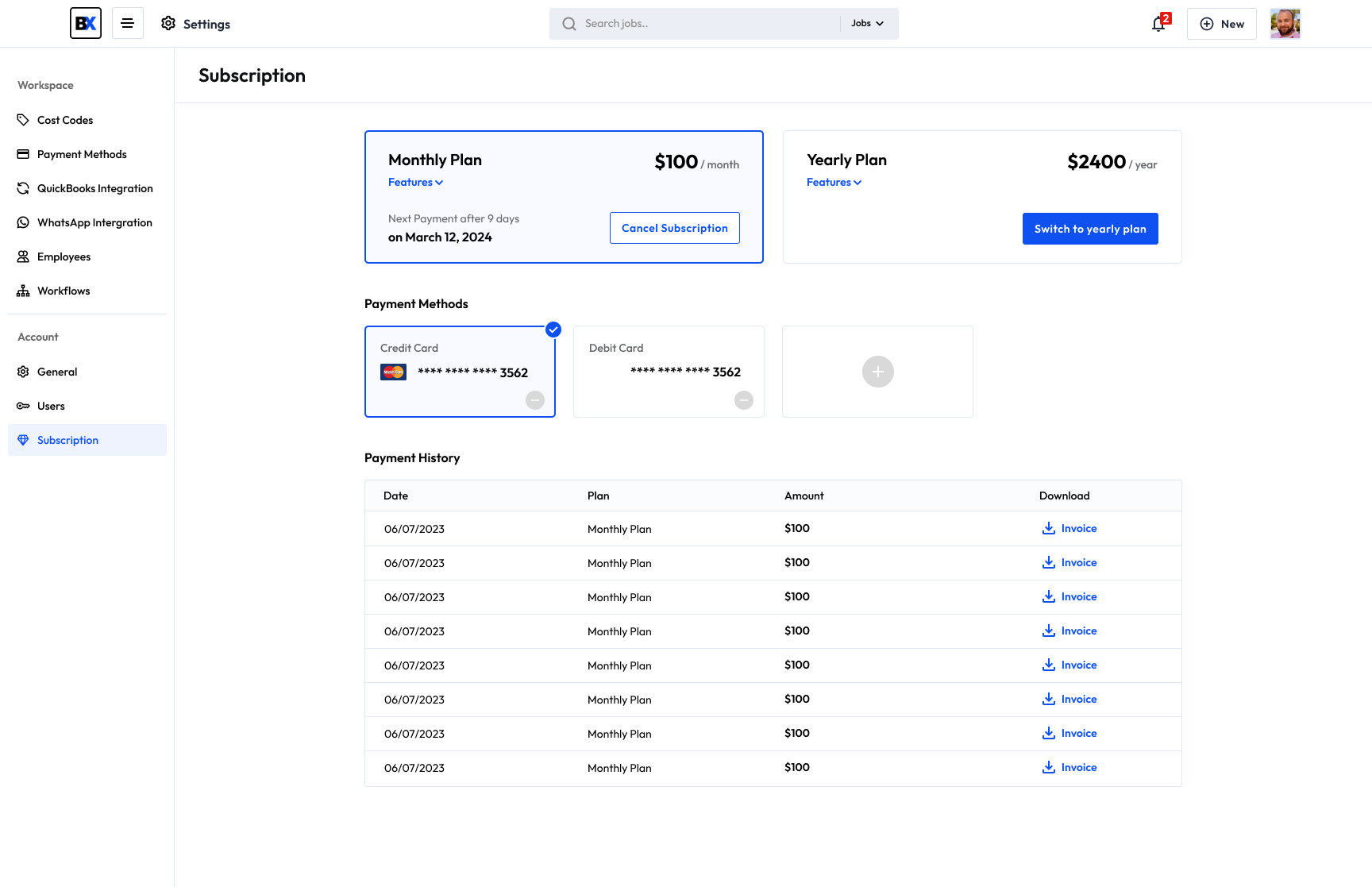
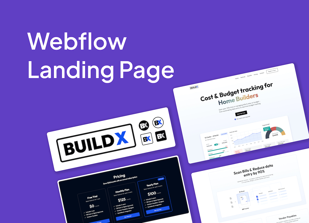
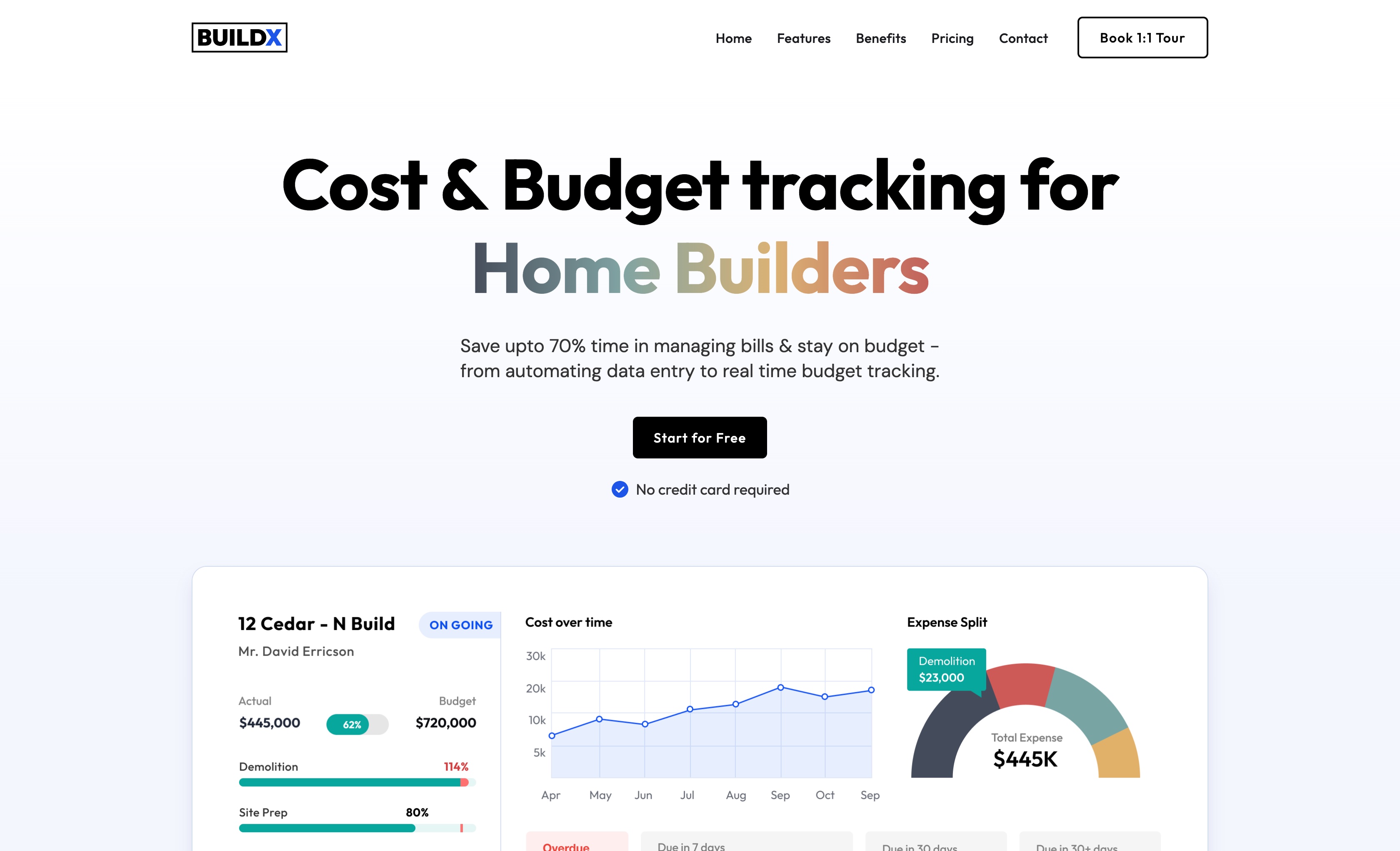
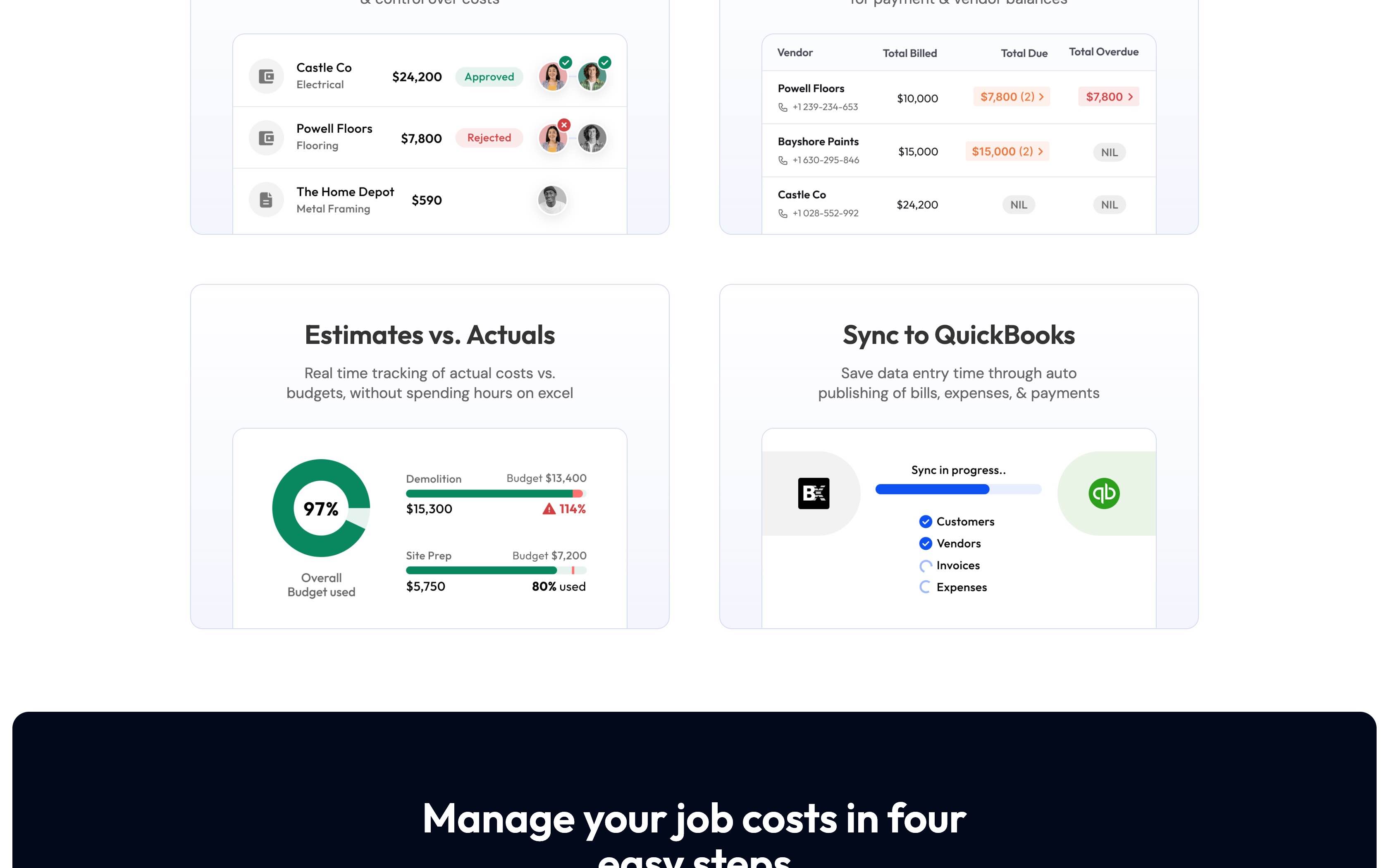
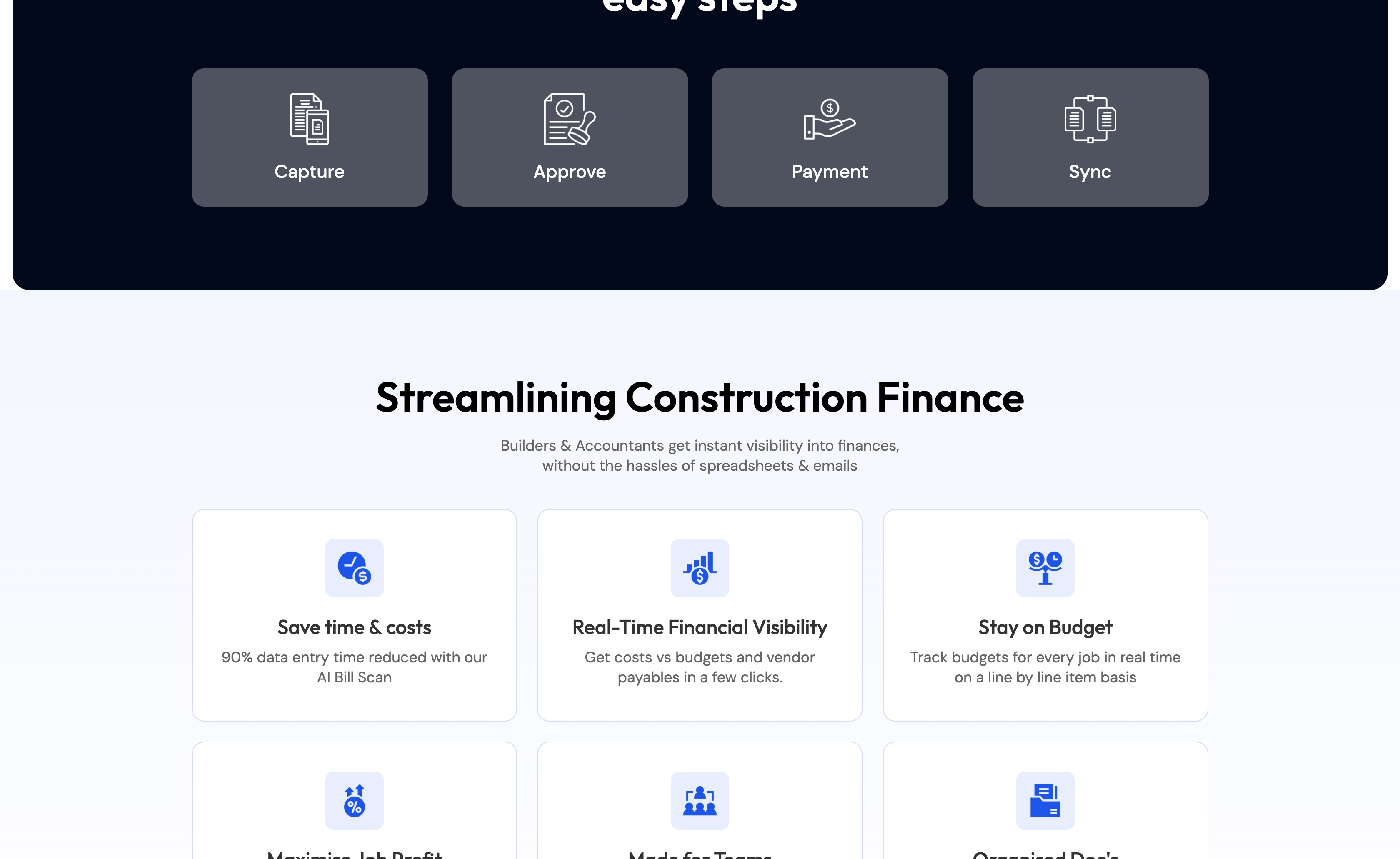
This case study details the redesign process for a fictitious expense management software BuildX. The goal was to improve the user experience (UX) by addressing pain points identified through user research, enhance overall user satisfaction and design new features. The existing information architecture is cluttered, making it difficult for users to find specific features. The expense creation process was cumbersome, requiring users to input excessive data points. The interface lacked visual cues to prioritize important information.
Design Process
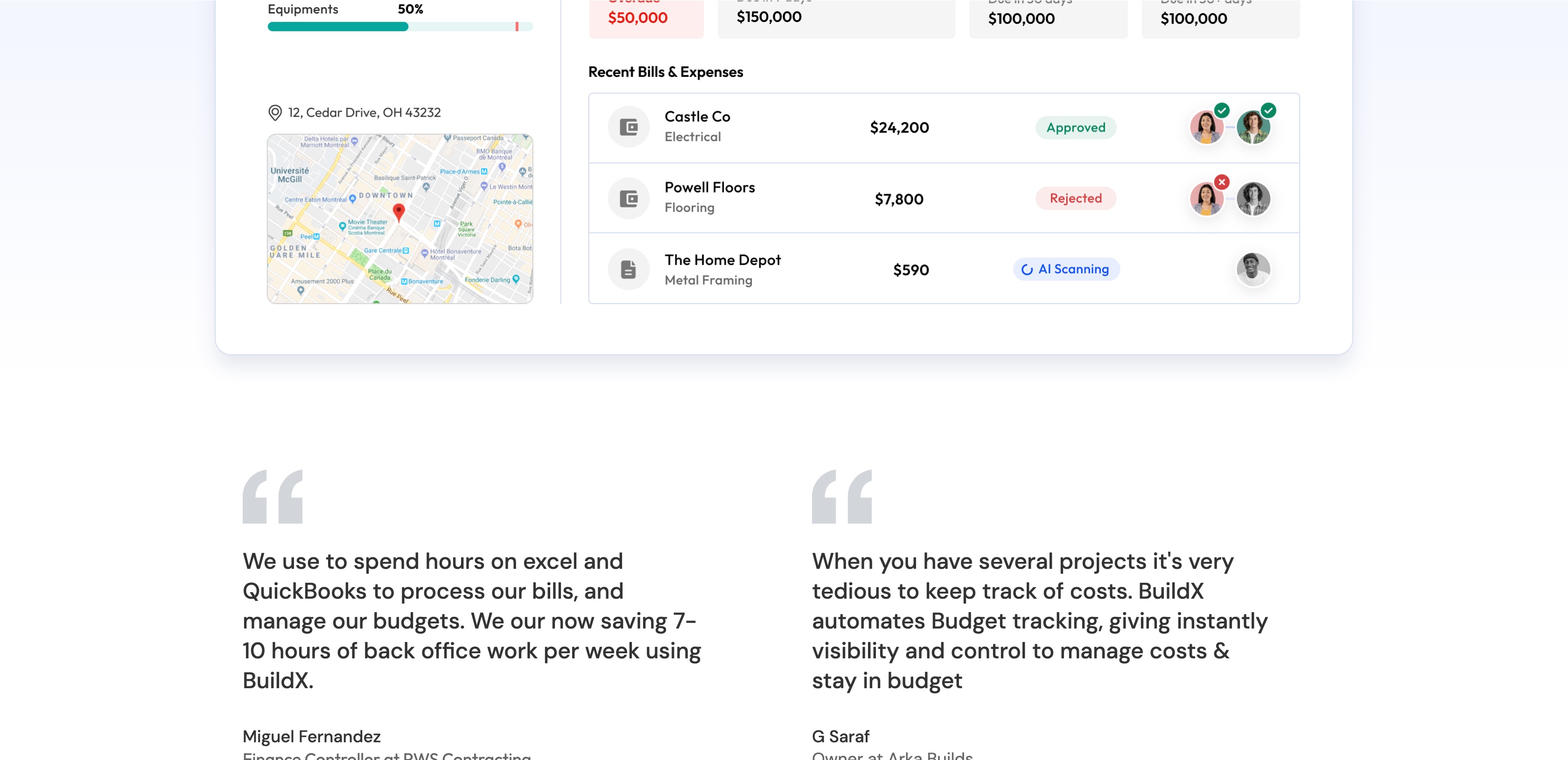
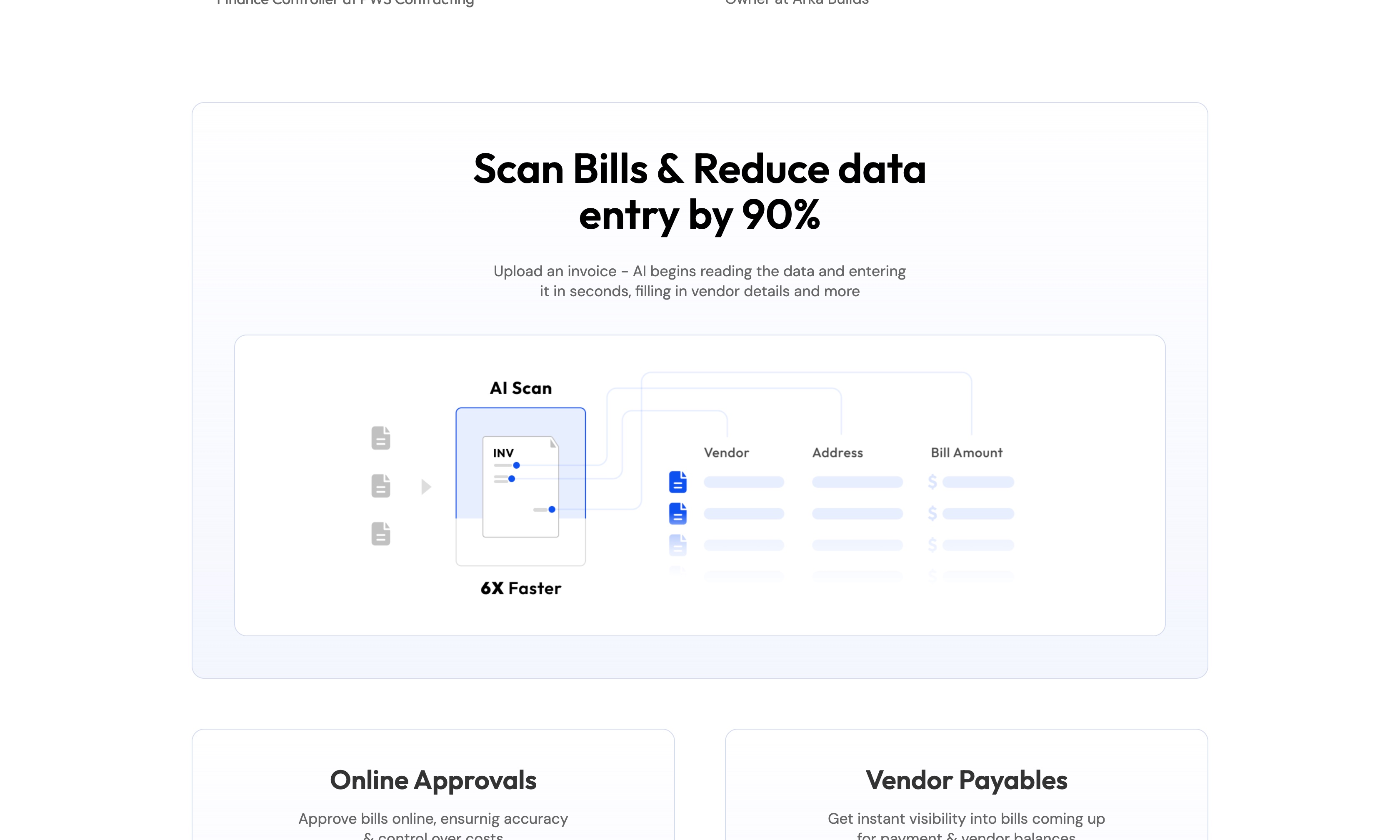
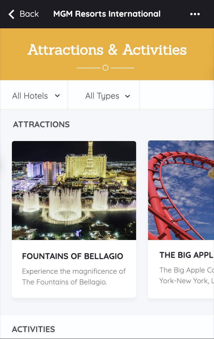
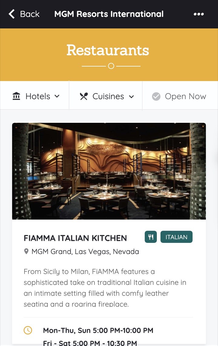
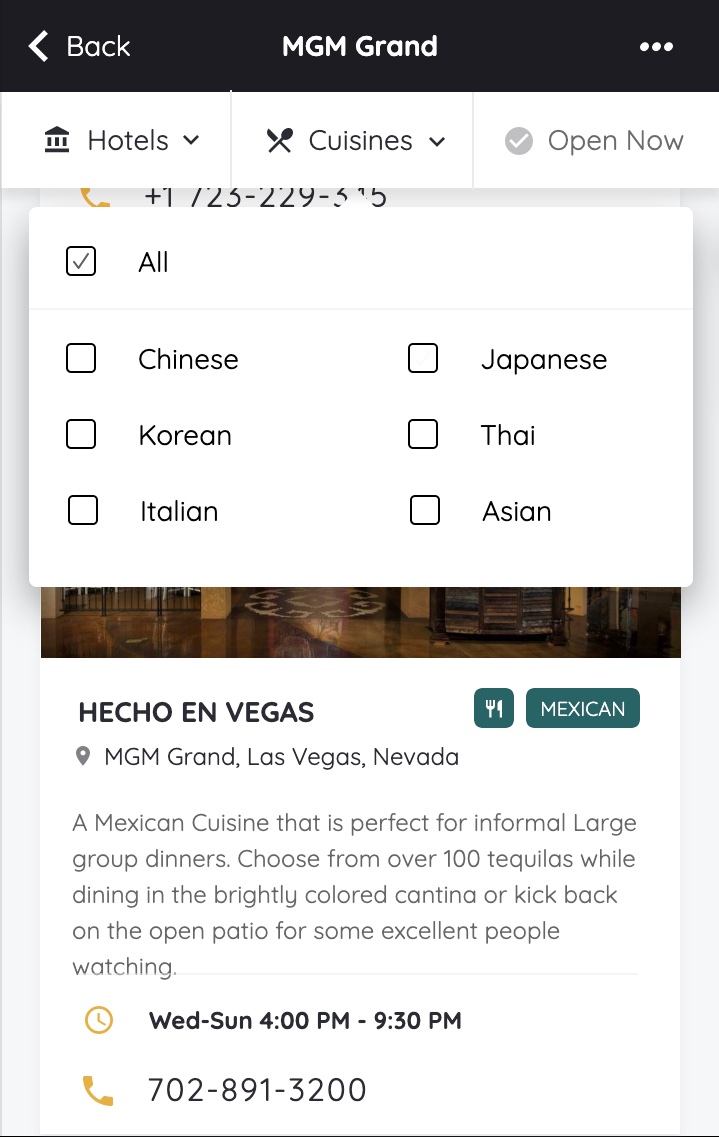
Dashboards and reports provided real-time insights into spending patterns and budgeting progress. A streamlined interface with receipt scanning and automatic data extraction minimized manual data entry. The newly designed Budget screen facilitates planning and tracking of project budget.
Design Solutions
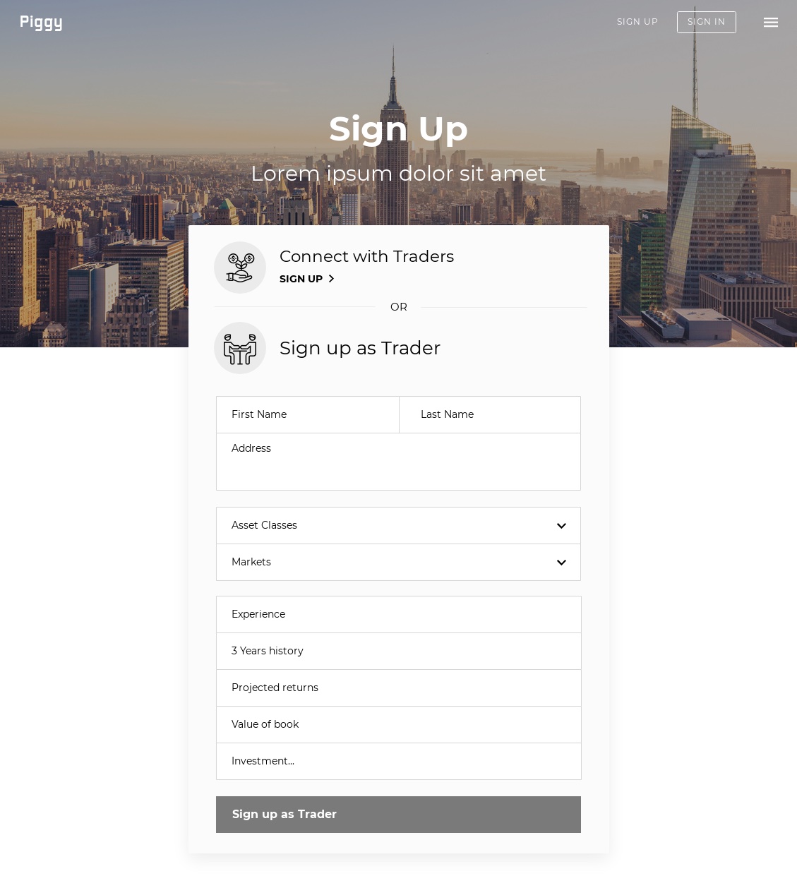
Case Study
Introduction (The Problem)
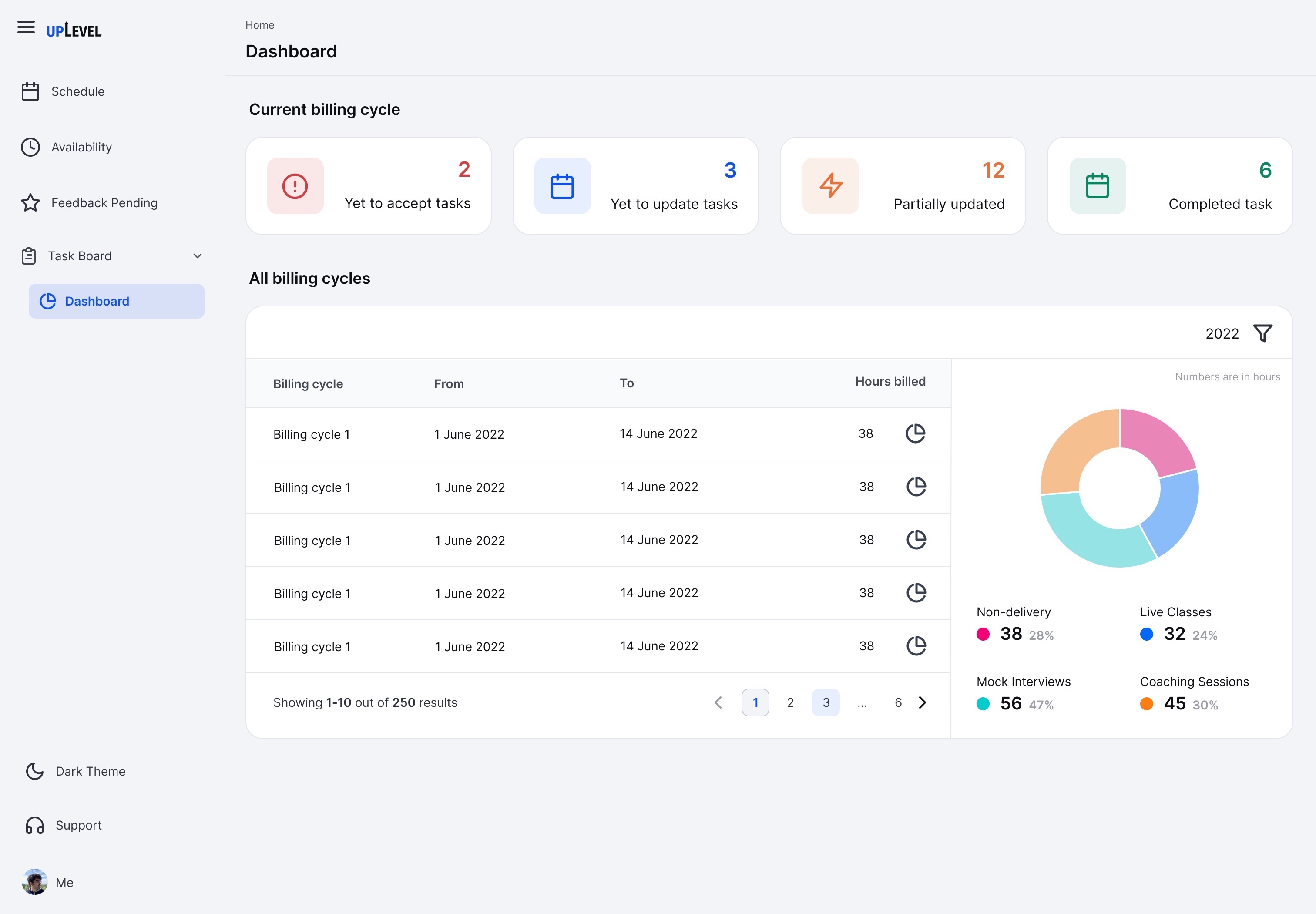
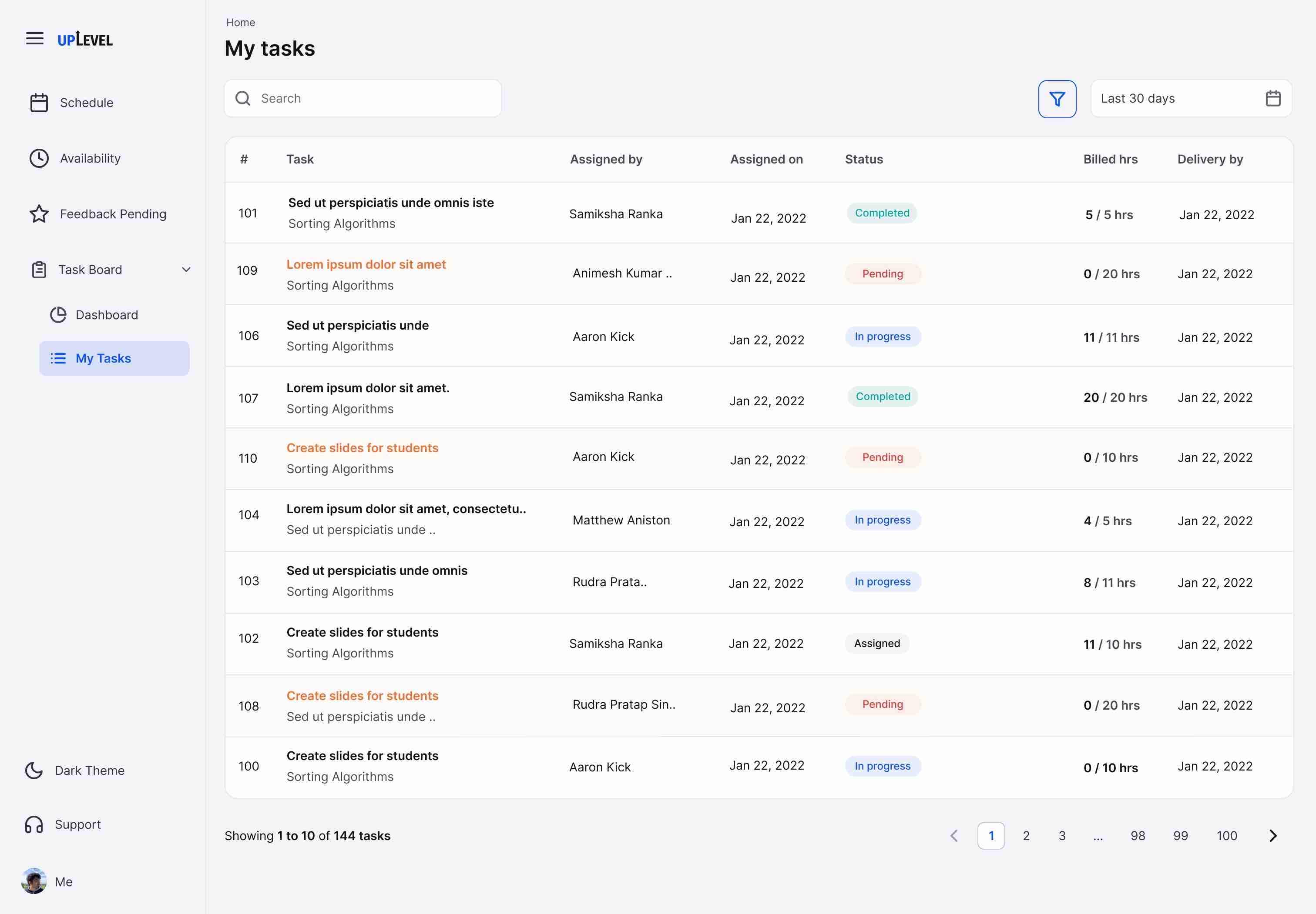
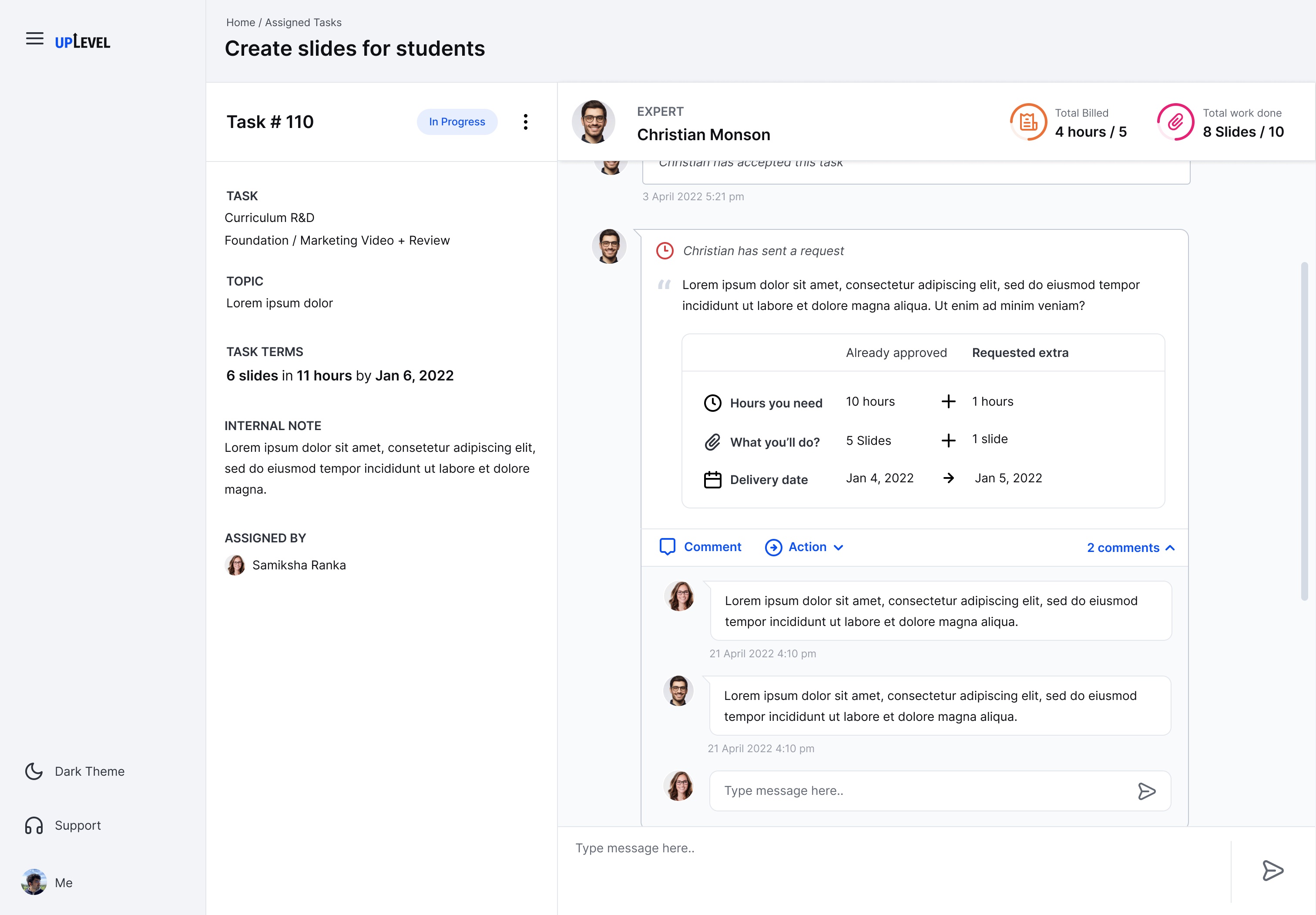
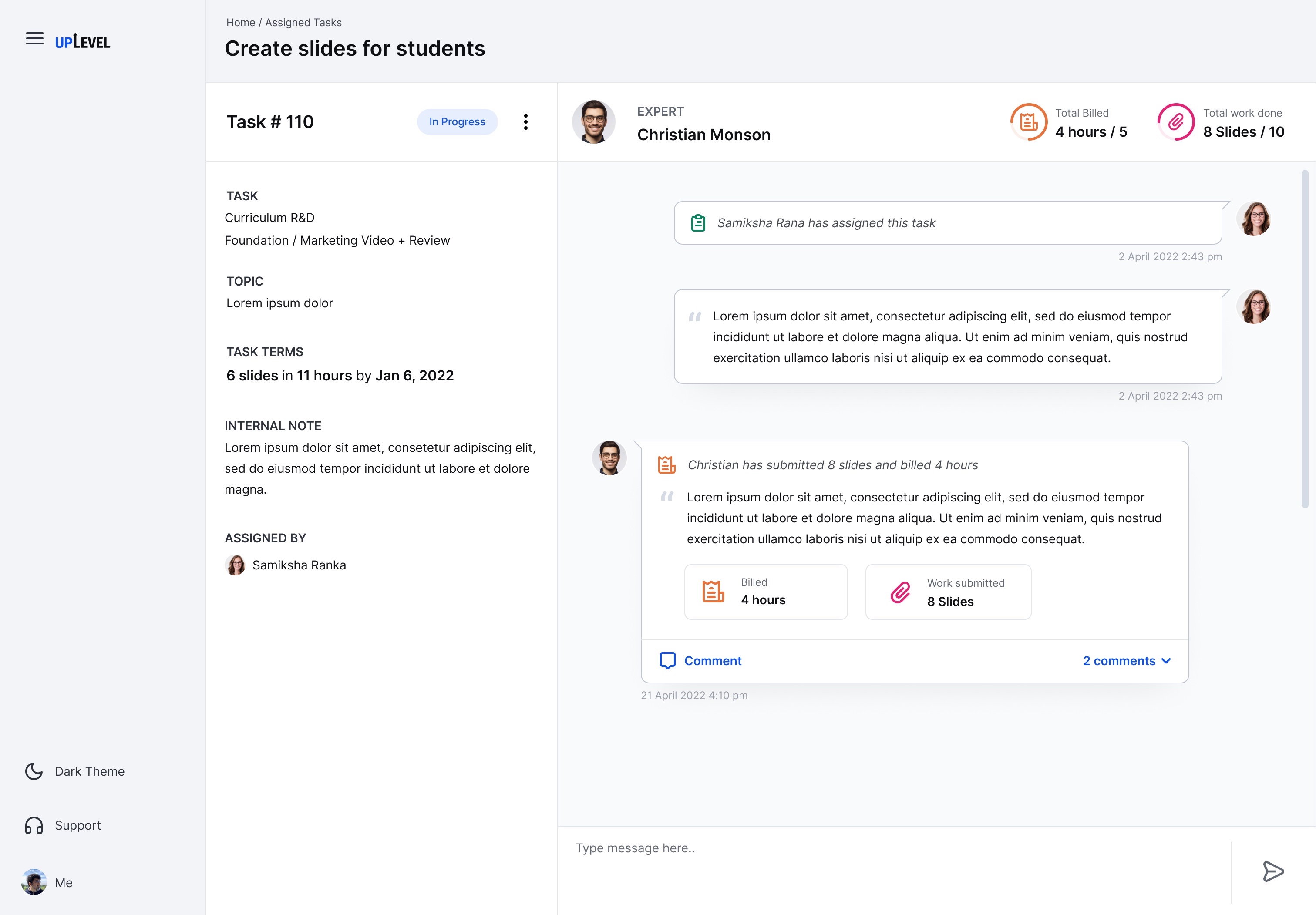
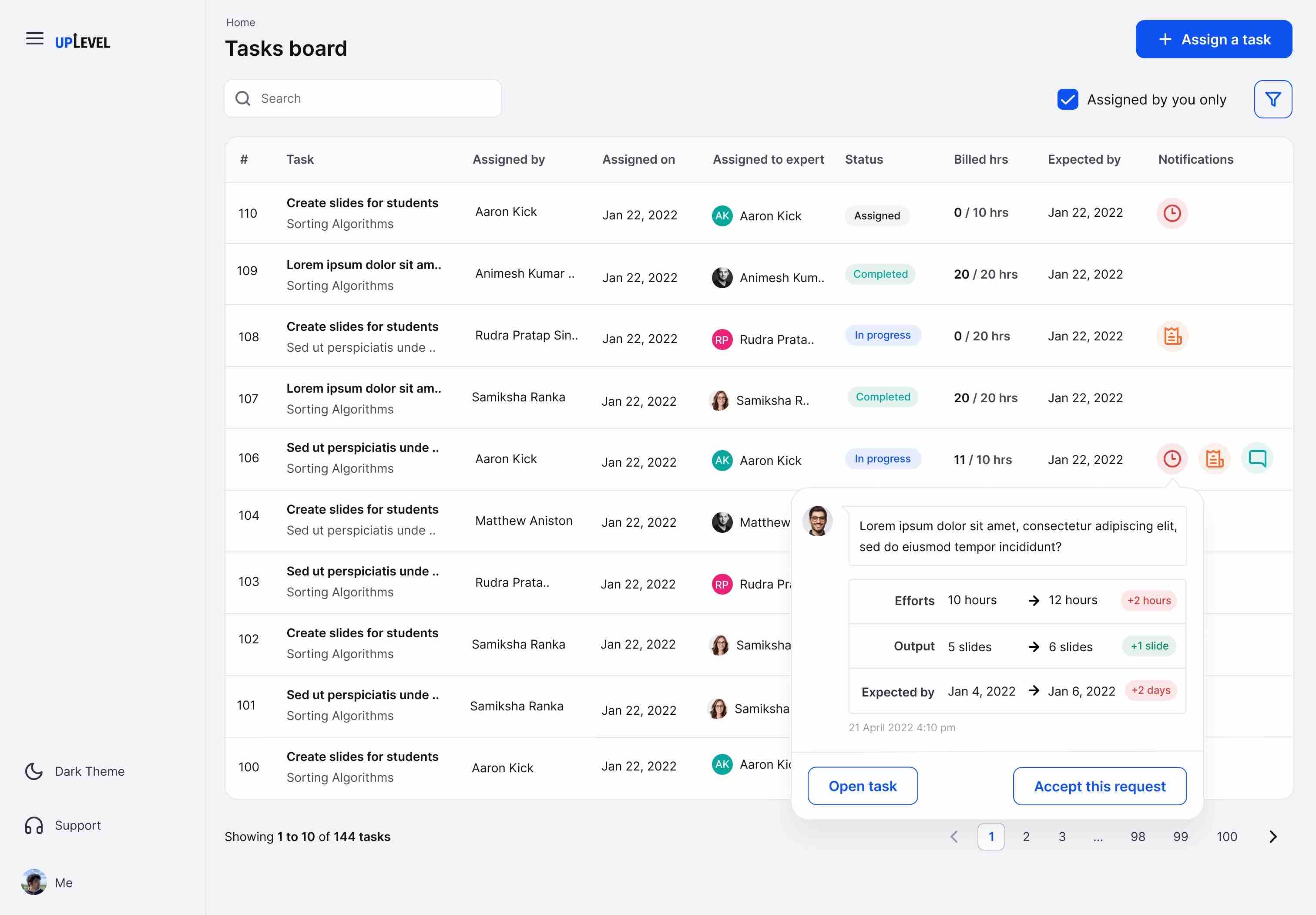
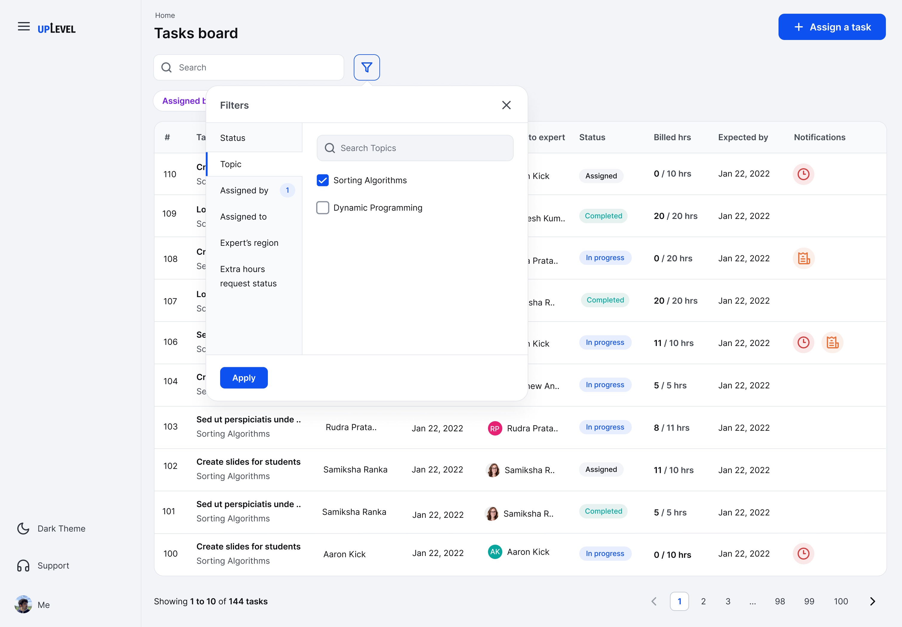
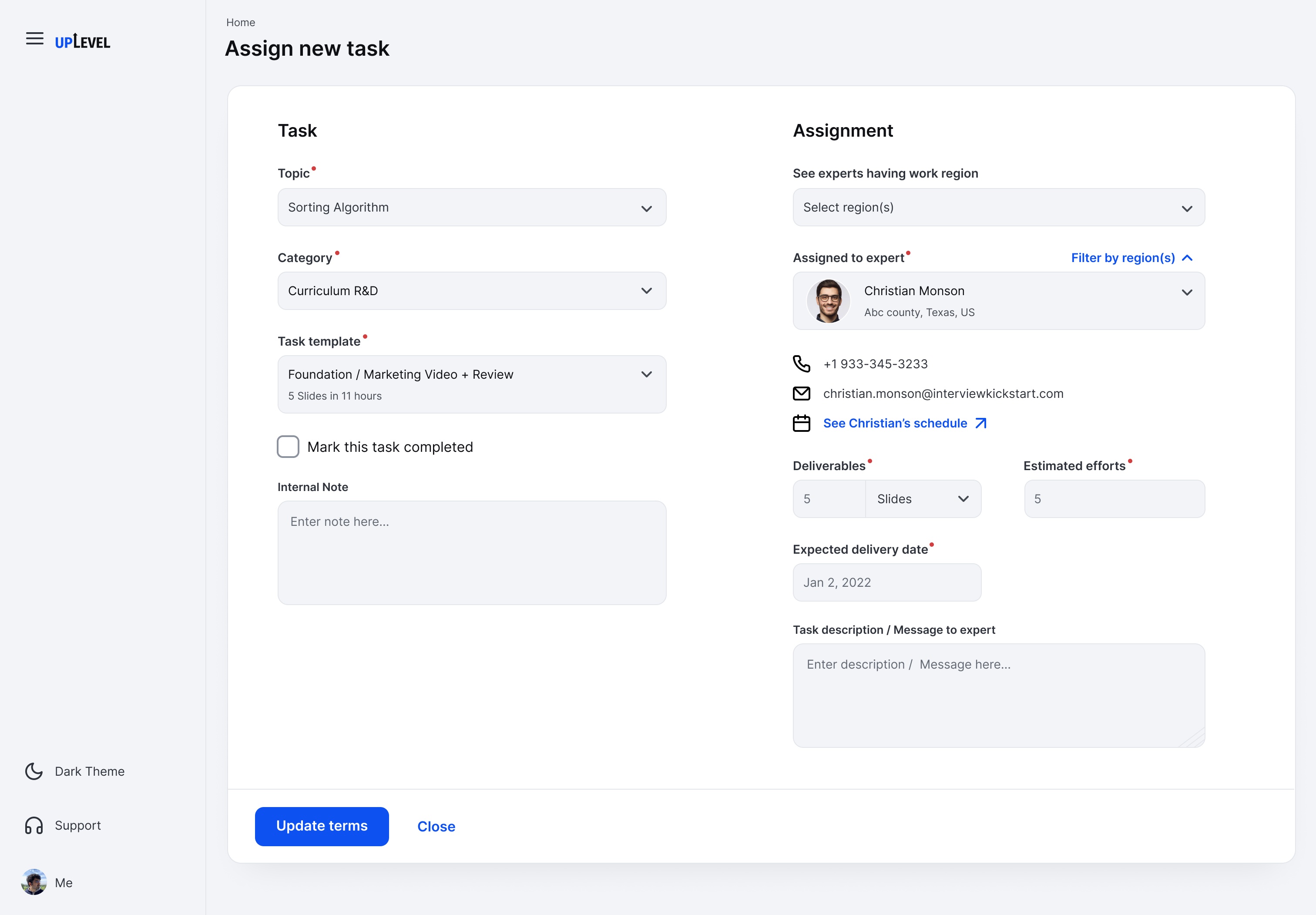
The users for this problem are Admins of the organizations and Contractors who are given tasks to take interviews of candidates. Task assignment and management rely on phone calls and spreadsheets, leading to inefficiencies. Agreed-upon interview details (commercials) aren't captured, resulting in conflicts. Admins struggle to track task progress and interviewer performance. Difficulty in monitoring assigned interviews, status changes, and requesting effort adjustments.
Design Process
Conducted user interviews with Admins and Interviewers to identify pain points with the current phone call & spreadsheet system. Analyzed existing process workflows to understand task assignment, communication, and tracking inefficiencies. Researched existing interview scheduling software solutions to identify best practices and potential feature gaps.
Design Solutions
Case Study
Introduction (The Problem)
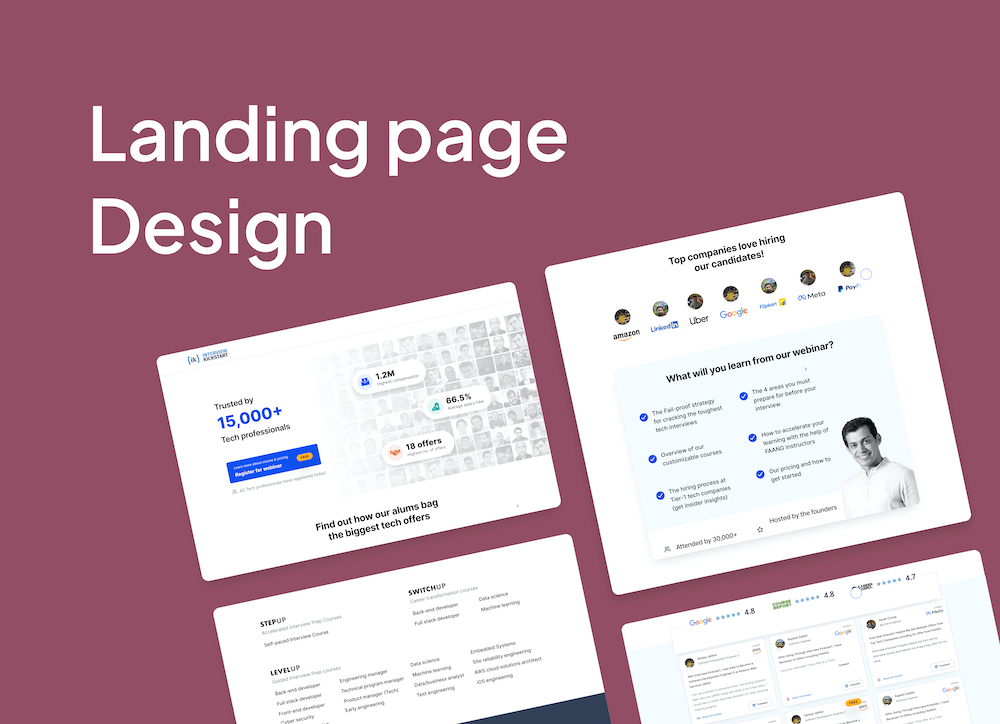
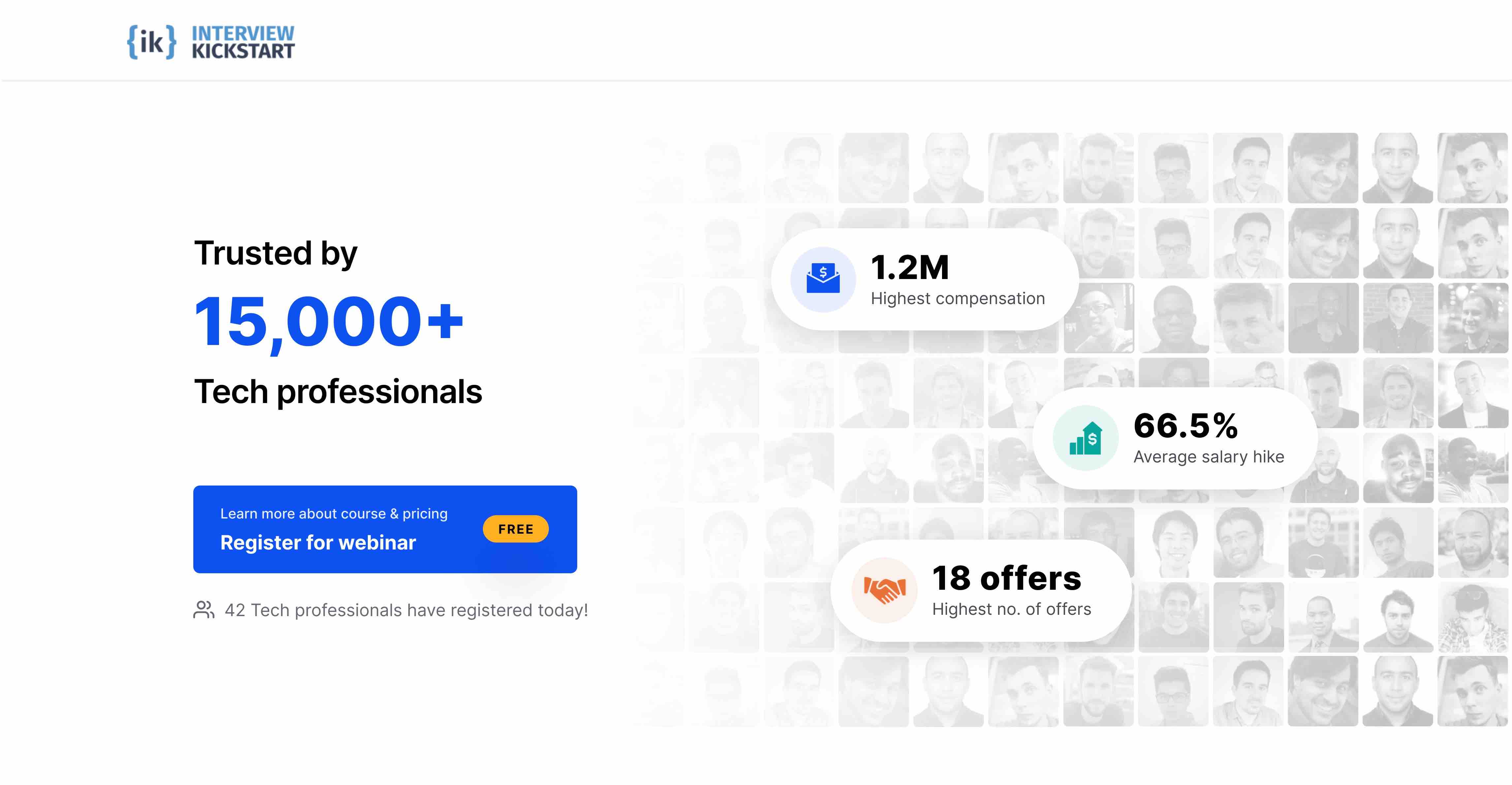
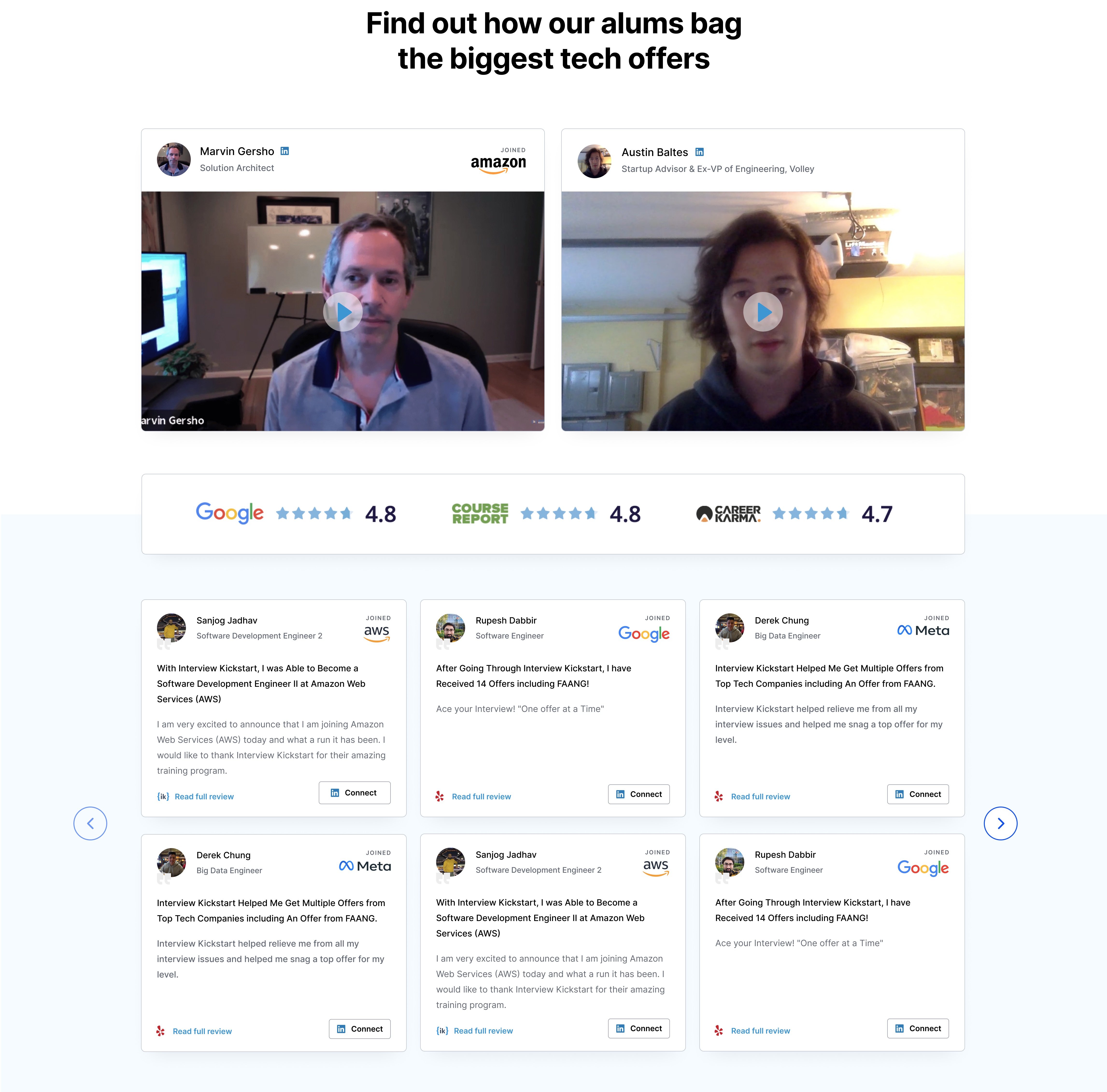
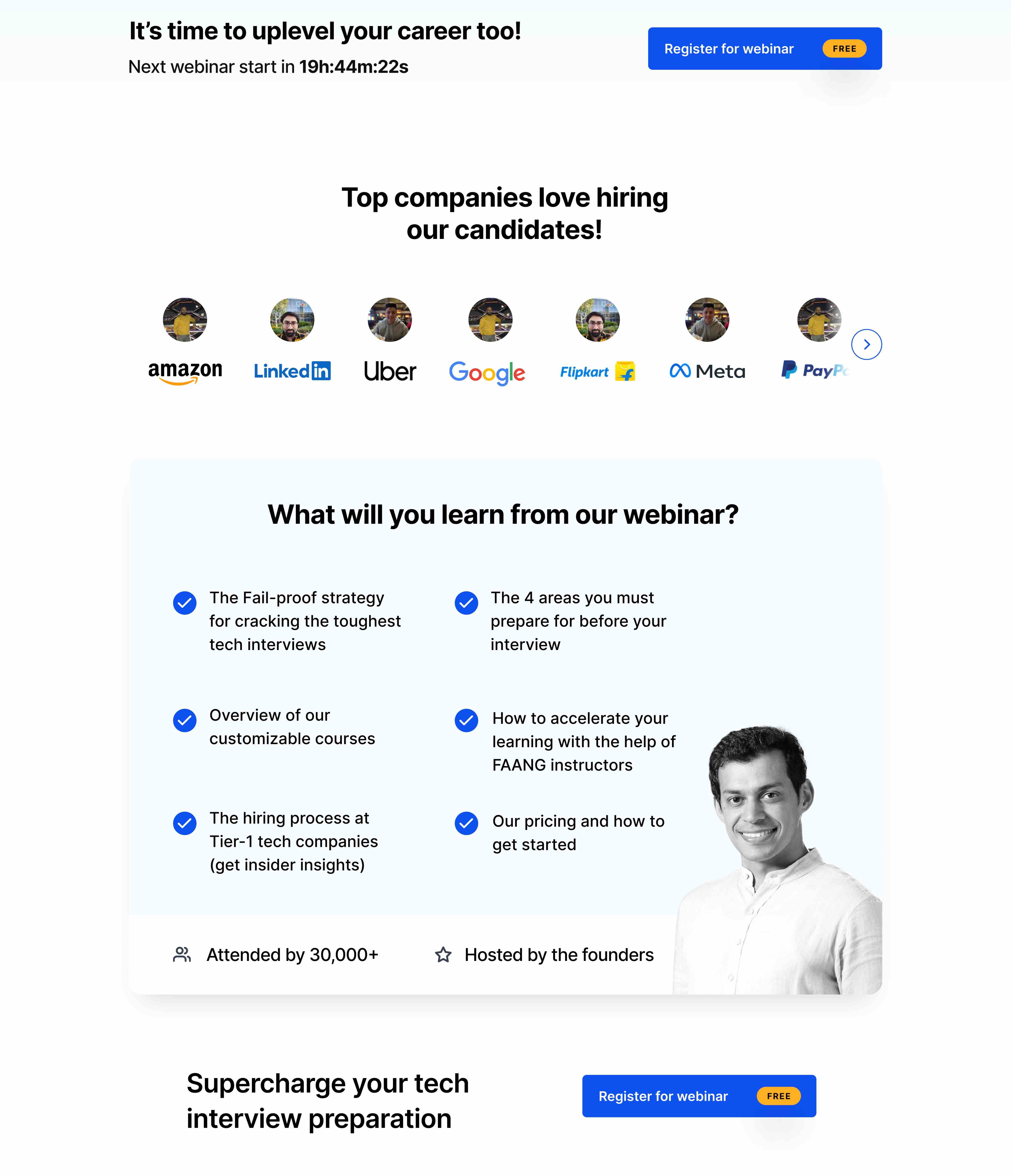
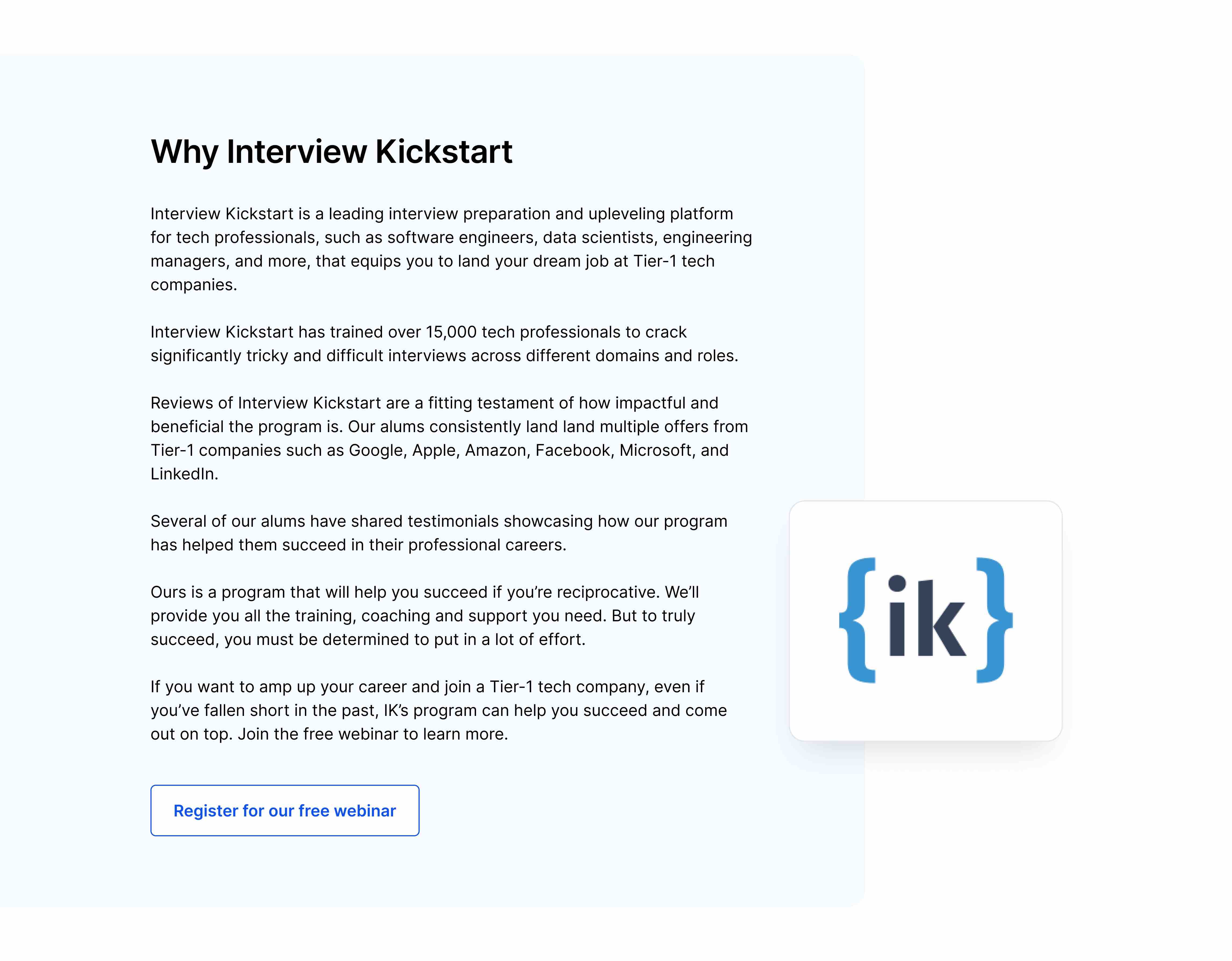
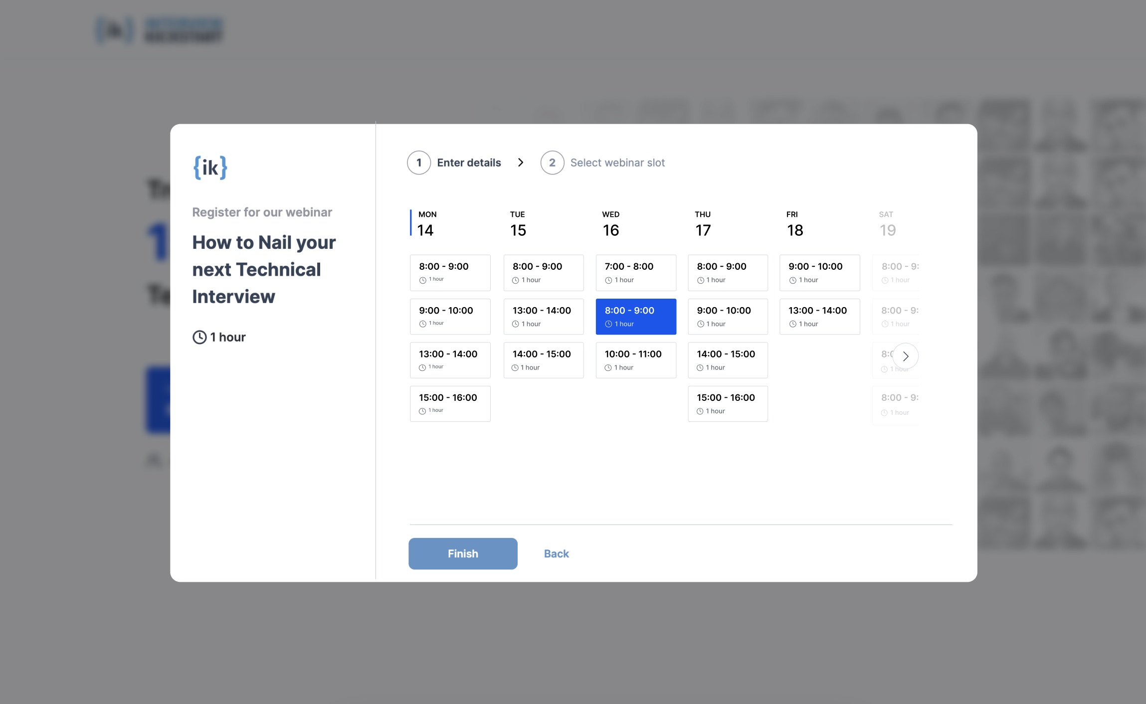
The original landing page suffered from low conversion rates. User data revealed high bounce rates and minimal engagement with the existing content. Potential reasons included: Visitors didn't immediately understand the course benefits. Credibility and trust in the course wasn't established. Information overload made it difficult for visitors to focus on key points. Signing up for the webinar was not intuitive and was multi-step hassle.
Design Decisions
I used a clean and professional design with high-quality images and engaging video snippets to showcase the success stories. Ample white space was incorporated to create visual breathing room and guide user attention through the page. A clear hierarchy of information prioritized important details without overwhelming visitors. The registration popup minimized form fields, allowing for quick and easy sign-up with minimal disruption. The calendar view for selecting webinar slots was designed for clarity and ease of use.
Design Solutions
Case Study

Case Study
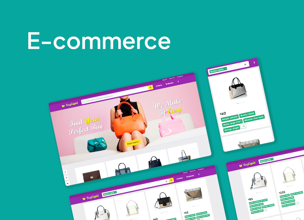
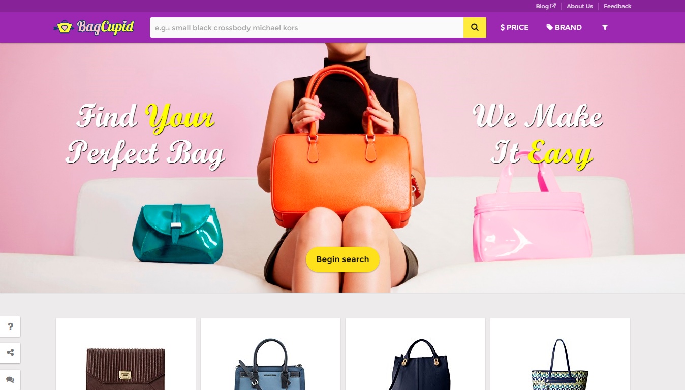
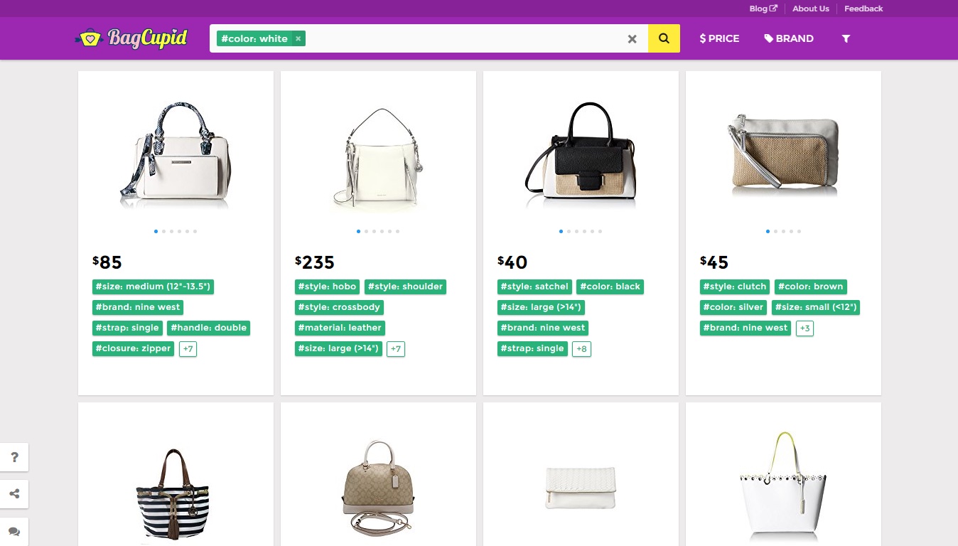
Introduction
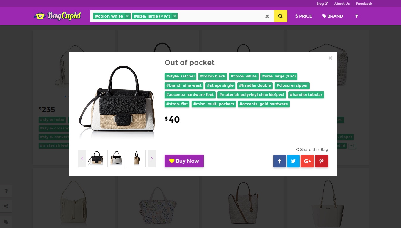
The Client wanted to build an online platform showcasing curated collection of bags. This website should offer many filters and people should be able to find the bag they are looking for quickly. After finding the right bag, people can jump to Amazon and buy it. From this affiliate marketing of bags, client wanted to earn money.
Design Challenges
Users should effortlessly find their ideal bag through a robust filtering system that caters to various style preferences, functionalities, and price points. High-quality product images and detailed descriptions were crucial to showcasing the bags' features and aesthetics effectively. The platform should offer a smooth transition from browsing to purchase, allowing users to easily navigate to the respective Amazon product page for checkout.
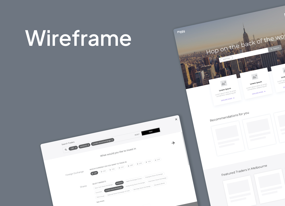
My Design Solution
Users could filter bags by brand, material, size, style (e.g., tote, backpack, clutch), color, price range, and additional relevant criteria. Each bag was presented with high-resolution images, clear descriptions, and key specifications to facilitate informed decision-making. A well-organized navigation menu and clear call-to-action buttons ensured users could easily browse, filter, and access the linked Amazon product page.
Case Study
Case Study